Color Blindness Testing Poster for Children

Mike McLane’s son is colorblind but they didn’t really found out about it until his son was in the 4th grade. By knowing about his deficiency only afterwards teachers could support him and so Mike’s son didn’t receive bad test results anymore just because of his red-green color blindness.

That is why Mike created a Color Blindness Testing Poster. It can be used as an initial screening. Only if a child can not see the numbers and signs on it a doctor should be consulted for proper testing. The poster works very well with children of age 5 or 6 years, as Mike writes on his web site.

Color Blindenss Testing Poster

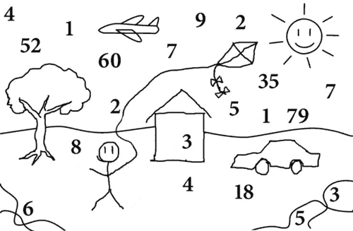
Hover over the image to unveil the signs

As for my person I just feel like a blind man when I look at all the dots. Only at the bottom to the left and right side I can see some lines and that’s about it. Nothing else! Well, if I look very close I can see some numbers. Somewhere I spotted the number 99 until my wife corrected me — it is the number 79.

There are approximately 8% of men affected by color blindness. As a conclusion there is about in every school class a child which has some kind of color vision deficiency and usually this isn’t recognized immediately. But if the teacher and the child would know about it there learning experience could be improved a lot.

Color blindness is frustrating not only for the affected child but also for teachers. It can lead to unexplainable test results, completely wrong answers and misunderstandings. If color blindness is understood a teacher can support affected children by choosing correct colors, supporting colors with signs and be a helping hand if colors are the source of understanding for example in biology classes.

Arlene Evans found out about this lack of information when she was working as a school teacher. That’s why she wrote a book on color vision deficiency for children to explain this phenomenon in simple words and pictures. She also gives some hints and tipps for everyday life. The book is not only a good source of information for children but also for teachers and helps to better understand color blindness and how you can support children affected by this deficiency.

Dear teachers, please learn more about color blindness, try to understand it, be aware of it whenever colors are involved or even buy one of this posters. You are confronted with color blindness every day — even if you don’t know about it yet.

Related articles:
Arlene Evans Books about Color Blindness
Colorblind Population
Color Blindness Test by Dr Shinobu Ishihara

Direct link to the Color Blindness Testing Poster web site.

Color Oracle

Color Oracle
Color Oracle

Color Oracle is a full screen color filter released by Bernhard Jenny of the Institute of Cartography, ETH Zurich. Because the swiss federal institute of technology (ETH) is just around the corner of where I am living I proudly pass on some notes about this new tool.

As the tool is Mac only I couldn’t have a closer look at it because I am “PC only”. But the homepage gives some clues about the features of Color Oracle which are listed below.

  • Simulation of deuteranopia, protanopia and tritanopia
  • Dragable and resizeable information panel
  • System-wide menu and keyboard shortcuts
  • Saving of filtered screen images

As mentioned above if Color Oracle is turned on the actual full screen is appropriately simulated independently of the software you are using for designing your art.

And if you are not a proud owner of a Macintosh the team of Color Oracle provides some further links about similar tools and online possibilities for simulating colorblind vision.

Related articles:
Colour Contrast Analyser
Simulating Color Blind Vision
Colorblind Web Page Filter

TV Test Patterns

TV Test Pattern BBC
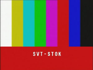
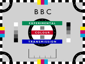
Do you remember the early days of color television? Where only a handful of TV channels existed and programs were not running 24 hours a day and 7 days a week. Those days were the glory days of test patterns, also known as test cards.

The patterns were originally real cards used to calibrate the cameras. Soon they were replaced by patterns generated by test signal generators which could be used to adjust the equipment for optimal functionality.

TV Test Pattern CNCT ZRCH
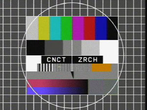
Seen through colorblind eyes a modern LCD computer monitor has a many times better color reproduction than any color television. When looking at these pictures this feeling gets supported very much. The colors feel dull and almost interfere with each other. There is not a clear and crisp vision of the colors at all. This observation raises the question to me: Does somebody affected by color blindness have an even worse color impression on a color television compared to normal vision?

TV Test Pattern SV STOK

I don’t know the answer. Maybe some of you made some similar observations and share this feeling.

But let’s get back to the test patterns. If you look at the colors on the second and third image they are very badly chosen for somebody being red-green colorblind.

I will try to show you what I mean by listing my view of the colors starting at the left hand side:

  • white or very light gray
  • orange or light green
  • light gray
  • light green or orange
  • pink close to blue
  • red
  • dark blue or purple
  • black

The colors of the stripes 2 and 4 and of the stripes 5 and 7 are very close together for my eyes. These are very typical colors to be mixed up by protanope or deuteranope people. What perturbs me a bit is, that stripe number 6 is a clear red to me. No way this could be green even though I am red-green colorblind.

Further readings:
The Test Card Gallery
tv-testbild.com (German)
Wikipedia: Test Card

Related articles:
Green versus Orange
Colorful Ropes
Playing Trivial Pursuit with a Colorblind
Imagine the Green is Red

Top 10 of Colblindor’s First 3 Months

The third month of Colblindor is just over and as I learned this is a first critical milestone to reach on the way to get a lasting weblog running. Maybe one day Colblindor will reach this climax and until then I would like to share some statistics and facts with you of the first days.

First of all I will show you the top ten articles of Colblindor as they are measured by Performancing Metrics. This measurement takes into account all articles since this weblog started on the 21st February 2006.

  1. Color Blindness Test by Dr Shinobu Ishihara (March 15th)
    A lot of people are looking around for tests about color blindness. The most well known test was introduced by Mr Ishihara, a Japanese professor, in the last century. I listed my (disappointing) test results in the article. Maybe you have yours as well?
  2. Fuck the Colorblind (April 1st)
    I don’t no why but this article got many hits through Google. If I read through the comments, I must have a very hardliner opinion. The readers seem to enjoy the t-shirt very much – no matter if they are colorblind themselves or not and if they bought it or just have seen it on the road. Maybe I have to reconsider my point of view.
  3. Daltonism – Named after John Dalton (April 9th)
    An article about John Dalton, born in the 18th century, who was researching his own color blindness and shaped the wording Daltonism.
  4. BP advertises with Ishihara Pictures (March 17th)
  5. Firefox Extension – Colorful Tabs (March 29th)
  6. The Biology behind Red-Green Color Blindness (March 7th)
  7. 5 Misbeliefs about Color Blindness (March 30th)
  8. Are cats and dogs really colorblind? (February 28th)
  9. Simulating Color Blind Vision (February 25th)
  10. Battle Against Color Blindness With EyePilot (March 24th)

At the moment about 40 distinct visits are counted every day. Not much but for me this is much more than I thought of when I started in February.

There are 72 posts written on this weblog (including this one) and the highest comment entry count was scored by Fuck the Colorblind.

I gathered some experiences while Shooting at Digg and Reddit and Colblindor was featured as a Blog Case Study at ProBlogger.

That’s it with figures and facts. I also would like to hear from you; your opinion and maybe even some hints what could be interesting topics to talk about.