
I found this little tool where you can show Websites at Graphs through ProBlogger. So I thought I’ll join in and put up the graph produced by my weblog.
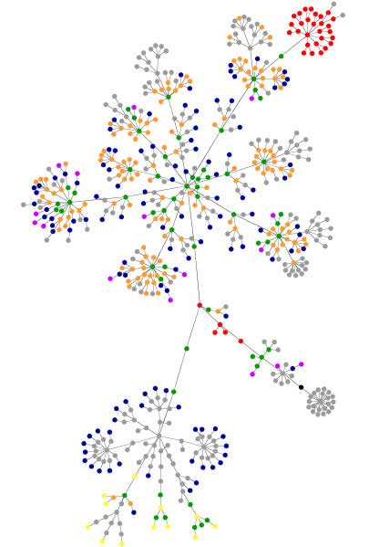
blue: for links (the A tag)
red: for tables (TABLE, TR and TD tags)
green: for the DIV tag
violet: for images (the IMG tag)
yellow: for forms (FORM, INPUT, TEXTAREA, SELECT and OPTION tags)
orange: for linebreaks and blockquotes (BR, P, and BLOCKQ. tags)
black: the HTML tag, the root node
gray: all other tags
As the dots are quite small my color blindness gets in my way to read the graph at its full value. It is not easy at all to tell the different dots apart from each other because the colors are not distinguishable.
- Where is the Black dot among all those Blue ones?
- Blue is very close to Violet,
- Orange flows into Green,
- Green is anyway the same as Red and
- Yellow is sometimes hard to see at all.
It would be much better to use some kind of patterns to distinguish the different types. Only three different colors should be used in graphs that they can been told apart even by colorblinds. If you have a look at the legend above you would have to choose three well distinguishable colors and two extra patterns to make the website graph more readable.
If you like this graph, generate one yourself at Websites at Graphs or browse through the websitesasgraphs tag of Flickr.
Related articles:
Subway Maps
Color Code Power Types
Green vs. Orange
FYI: I checked through the network, and magnified it even in a paint program, and I could find no black nodes.
Thanks for the hint. I made a mistake while trying to save bandwith. Changing it to a 32 colors gif graphic let the black point disapear. So I switched back to a jpg image.
The black dot is now visible again at the lower right hand side.