Joshua Tauberer wrote a nice post about how you can take color blindness into account while choosing a new color scheme.
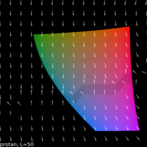
Based on the confusion lines of the CIE 1931 color space he made a transformation into the CIE LAB color space. In this space equal distances in the color space represent equal amounts of perceptual distance. It’s nice to see that the confusion lines which emanate from a single point in CIE 1931 are in the CIE LAP space represented by parallel lines.
The arrows in the graphic below don’t show the confusion axis but paths that go perpendicular to the confusion lines which will have maximal perceptible differences for a specific type of color vision deficiency.

There are some more nice graphics included in the article and even some code which can be used to generate those. Visit the original article at Designing accessible color spectrums.
Unfortunately I think it is still not that easy for non-colorblind people to choose good colors which are distinguishable even for the strongly color blind among us. But if you stick to less colors with large brightness differences you are always on the better side.

I don’t have a clue how to read this graph.