Color Blindness Simulation in Short Films

Carlos Hernandez Matas created in 2011 three short films demonstrating the three main forms of color blindness: Deuteranopia, Protanopia and Tritanopia. There are many simulators for color blindness available online. One of them can be found right here on Colblindor: Coblis — Color Blindness Simulator.

Carlos explaines how he did those videos:

This is a program that retrieves images from a live video feed or from a video file stored in a drive and performs in real-time a color transformation to show how the video would be seen by one of the three kinds of dichromat color blind people. In this video, it’s shown the transformation for people with tritanopia.

Deuteranopia

Protanopia

Tritanopia

More information can be found on his website at carlos.hernandez.im.

Color Vision Deficiency Tutorial

Richmond Products – Color Vision Deficiency

Richmond Products is one of the big sellers of examination products for ophthalmology, optometry, pediatrics, neurology, and occupational medicine. But specially in the field of color vision they are strong and offer a wide variety from different products, ranging from color arrangement tests, pediatric color vision tests, the world famous pseudoisochromatic plates tests (also often called Ishihara plates tests), and a lot more.

As color vision deficiency is still a topic where a lot of people can learn a lot more, they put together a tutorial for everyone free to download. The tutorial was put together with the help of well known researchers in the field of CVD. Specially Dr. Jay Neitz and Dr. Maureen Neitz, which were in the news with their breakthrough in The Cure of Color-Blind Monkeys.

The color blindness tutorial includes the following four chapters:

  1. Causes and Effects
  2. Detection and Diagnosis
  3. Toxicology Effects on CVD & their Detection
  4. Treatment, ‘Compensation’ & Cure

With its packed 14 pages it definitely covers many topics related to color blindness. If you would like to learn more about CVD it’s definitely worth reading. And if you read as well my Free eBook an Color Blindness, you’ll get a broad understanding on the topic.

Download: Color Vision Deficiency – A Concise Tutorial for Optometry and Ophthalmology

Was Vincent Van Gogh Colorblind?

The Hokkaido Color Universal Design Organization has a “Color Vision Experience Room” which filters out parts of the light to give you the impression of how colorblind people see the world. In this room Kazunori Asada spotted some paintings from Vincent Van Gogh and from there on the idea arose to make some tests, if Van Gogh might have had some form of color vision defiency.

Earlier on Kazunori Asada already developed a tool to simulate different forms of color vision defiency. With the help of this tool he was interested to see, if the impression of some paintings of Van Gogh will change, if they were run through the program.

In his article The Day I Saw Van Gogh’s Genius in a New Light he covers the following:

One of my friends who has protanomal color vision, a designer and painter, said this to me:

“It’s wonderful, isn’t it? We color deficient people, actually better than color normal people, understand van Gogh’s true nature and appreciate he is the genius of geniuses. In our opinion, van Gogh surely had color vision deficiency. Therefore, color deficient people can better understand his pictures.”

I considered this. After returning home, I viewed van Gogh’s works using the “Chromatic Vision Simulator” software which I had developed. However, the images simply lost their color and the sublime impression I got in the “Color Vision Experience Room” was missing.

Then it occurred to me to ask – Is my friend partially color vision deficient (anomalous trichromat)? Perhaps using a strong color vision deficiency (dichromat) simulation was the wrong approach. How about carrying out the simulation by removing only a specific portion of normal color vision, maybe then I could see van Gogh’s works in that light?

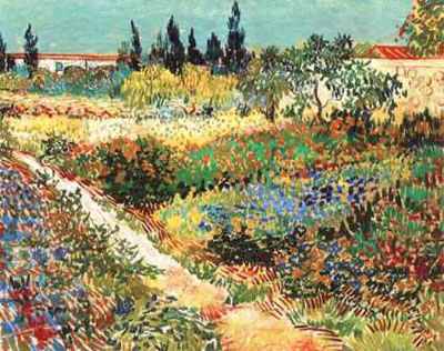
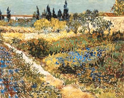
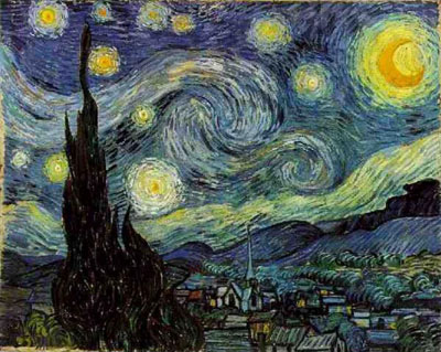
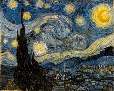
Hereafter two simulations of Van Gogh’s paintings. On the left side you’ll see the original, on the right side the protanomal simulation (also called red-weakness):

Van Gogh - Flowering Garden - Normal Van Gogh - Flowering Garden - Protanomal
Van Gogh - Starry Night - Normal Van Gogh - Starry Night - Protanomal

As I am also strongly red-blind I can’t see any difference in the paintings. Looking at them makes me think, that they look completely normal and I don’t see any very strange color arrangements in the paintings.

You can read the whole article of Kazunori Asada at: The Day I Saw Van Gogh’s Genius in a New Light. This article also includes some more paintings with their corresponding color vision deficient simulation.

Ishihara’s Test for Colour Deficiency: 38 Plates Edition

Dr Shinobu Ishihara introduced in 1917—almost 100 years ago—the most well known color blindness test. Each of his tests consists of a set of colored dotted plates, each of them showing either a number or a path. Since then this is the most widely used color vision deficiency test and still used by most optometrists and ophthalmologists all around the world.

There are other color blindness tests available, but none of them is as famous as the Ishihara plates. It is also well known, that even people with normal color vision sometimes struggle with this test. But nevertheless this plates are still in use in the absence of any better and still affordable color vision test.

Hereafter the 38 Ishihara Plates will be shown. If you would like to take an online test, please visit my collection of Online Color Blindness Tests.

Ishihara Plate 1 of 38 Ishihara Plate 2 of 38 Ishihara Plate 3 of 38 Ishihara Plate 4 of 38 Ishihara Plate 5 of 38
Ishihara Plate 6 of 38 Ishihara Plate 7 of 38 Ishihara Plate 8 of 38 Ishihara Plate 9 of 38 Ishihara Plate 10 of 38
Ishihara Plate 11 of 38 Ishihara Plate 12 of 38 Ishihara Plate 13 of 38 Ishihara Plate 14 of 38 Ishihara Plate 15 of 38
Ishihara Plate 16 of 38 Ishihara Plate 17 of 38 Ishihara Plate 18 of 38 Ishihara Plate 19 of 38 Ishihara Plate 20 of 38
Ishihara Plate 21 of 38 Ishihara Plate 22 of 38 Ishihara Plate 23 of 38 Ishihara Plate 24 of 38 Ishihara Plate 25 of 38
Ishihara Plate 26 of 38 Ishihara Plate 27 of 38 Ishihara Plate 28 of 38 Ishihara Plate 29 of 38 Ishihara Plate 30 of 38
Ishihara Plate 31 of 38 Ishihara Plate 32 of 38 Ishihara Plate 33 of 38 Ishihara Plate 34 of 38 Ishihara Plate 35 of 38
Ishihara Plate 36 of 38 Ishihara Plate 37 of 38 Ishihara Plate 38 of 38


Personal comment: I believe that this scanned plates have some shifts in color. They don’t really consist of the same colors as the original versions. With these plates I would suffer from deuteranomly as any other test shows that I’m suffering from protanomaly.

There exist four different types of plates:

  • Vanishing design: Only people with good color vision can see the sign. If you are colorblind you won’t see anything.
  • Transformation design: Color blind people will see a different sign than people with no color vision handicap.
  • Hidden digit design: Only colorblind people are able to spot the sign. If you have perfect color vision, you won’t be able to see it.
  • Classification design: This is used to differentiate between red- and green-blind persons. The vanishing design is used on either side of the plate, one side for deutan defects an the other for protans.

Try your best! If you can see all of them you are definitely color abnormal, as some of them should only be seen by colorblind people and others only by non-colorblind ones :-)

Short Film: Color Blindness Explained for Children

Quite a while ago Laura Evans created a nine minute documentary short film on the topic What is it Like to be Color Blind? The film gives everyone some insights on color blindness, including an interview with a colorblind person.

Shortly after that she also produced a children’s version, which I would like to show you hereafter:

What is it like to be colorblind?

If you wish to learn more about this project, you can visit Laura Evans website at No Such Thing as Color diretly.

Colour Vision Defective Pilots Association

I suppose the most prominent job and its problematics when it comes to any type of color vision deficiency is the job of beeing a pilot. Many young men wish to become a pilot and to fly airplanes but struggle on their way because of their color blindness.

This topic has been discussed on Colblindor already quite often. Either if it is about a Study on How Color Blindness Affects Pilots, about an Unreliable Secondary Color Vision Tests for Pilot Candidates or about a New Color Blindness Tests Sets Minimal Requirements for Professional Flight Crew. There is even some form of Color Blind Testing Guide for Pilot Applicants and some discussions going on in the Color Blindness Forum, for example the question: Should colorblind people be admitted as pilots?

Homepage of Colour Vision Defective Pilots Association

In March 2012 Dr Arthur Pope incorporated the Colour Vision Defective Pilots Association. The goal of this Association is to tackle the issue of a confuse approach when it comes to the regulations concerning color vision, to question its standards all around the world and to give support to those who feel unfairly treated as colorblind pilot candidates.

Dr Arthur Pape who was instrumental in two successful legal challenges in Australia in the 1980’s regarding the color perception standard in aviation. He is also coordinating actual legal challenges and wants to have the discriminatory standards removed. On the CVDPA Website he makes the following statement:

The aviation colour perception standard is a regulatory device that we say contributes nothing to the safety of aviation and the travelling public. It has no place in the modern aviation environment

It unfairly discriminates against many tens of thousands of individuals world-wide who have defective colour vision, who want to be professional pilots and who are perfectly capable of doing so.

The Colour Vision Defective Pilots Association’s Mission

  • Fight for the rights of all colour vision defective pilots to have an unrestricted career path by challenging the Aviation Colour Perception Standard.
  • To show that the aviation colour perception standard is founded on discredited assumptions and has no evidentiary basis
  • Establish a fighting fund from subscriptions, grants and sponsorship that will be used to fund challenges to the aviation colour perception standards in all worldwide jurisdictions
  • Promote and disseminate the outcomes of two existing pivotal court cases in Australia where most CVD pilots now enjoy full and unrestricted careers, at all levels of professional aviation
  • Give voice and organization to the countless thousands of CVD individuals and work to secure an end to irrational regulation

If you wish to get further information on this topic, to read some articles, to contribute your own personal story or to support the CVDPA, please visit their website at Colour Vision Defective Pilots Associationwww.cvdpa.com.

Map Accessibilty Survey for Colorblind People

Colored maps can be a major source of frustation for colorblind people. While research has been done by cartographers, many maps still disregard the special requirements for allowing a map to be read with a reduced color space. Online maps are no exception even though theoretically the dynamic nature of them could allow for options like multiple color schemes or even selective highlighting of specific map features.

Example of OpenStreetMap

Johannes Kröger, a student of geomatics from Germany, has been working on the street color rendering of the map on openstreetmap.org to analyse and improve its accessibility for people with color vision deficiencies. To test his hypotheses and the work he has done in his bachelor thesis he is currently looking for participants in an » Online Survey «.

The survey takes about 20 minutes, longer for some people, shorter for others. Simple map images are presented with the task of identifying street classes. It is a bit tedious and repetitive but that is the price for hopefully solid scientific results. It can be paused at any time.

Special interest would be in tritanopic (“blueblindness”) and achromatic (“colorblind”) people, since the participants so far have been mostly (expectedly) the more common forms of color vision deficiency in the red/green area. The survey is not suited for people with heavily affected focus eyesight though, so that might sadly limit the possibilities for participation of the completely colorblind.

Please join the online survey of Johannes Kröger and see, if you can see it…

Ishihara Plates on Your Fingernails

The colorful Ishihara plates are the most well known color blindness test of the world. They consist of a pattern of colored dots and hide a number or image for any colorblind observer.

On the other hand we can see more and more artwork on fingernails. There are contests held on diverse topics. One of them was about the dotting tool, a special tool which can be used to paint dots on your nails.

On of the contributors decided to use the dotting tool to create some Ishihara Fingernails….

Ishihara on Finger Nails

Personally I couldn’t imagine the create such a fine artwork. And to know, that it will be gone after some days, is even more impressive. Thanks for sharing this cool work and if you like, you can find a lot more of those artworks at Goose’s Glitter.

F-M 100 Hue Test: Compare Your Result with Others

A few days ago I released the F-M 100 Hue Color Vision Deficiency Test on Colblindor. Since then many people have taken the test which makes it possible to give you some added value on the test.

From today on you can also compare your result with “the rest of the world”. In the last tab of the test you will be able to see two diagrams: the first shows you the overall contribution of the different types. Your will be shown with an orange circle.

F-M 100 Hue Comparing Score

The second diagram below is all about the severity. Again your total error score is highlighted with an orange bar. This diagram shows you how others did in this test and if you are on the “better” or “not that good” side when it comes to see colors.

I hope you enjoy this added value and of course the whole F-M 100 Hue Test. If you have any questions or further suggestions, don’t hesitate to contact me.

F-M 100 Hue Color Blindness Test

Do you ever wanted to test your color vision with one of the most famous color blindness tests available? Try out the Farnsworth-Munsell 100 Hue Color Blindness Test (F-M 100 Hue Test) and see how good you are in color ordering.

This test is a very typical arrangement or also called hue disrimination test. It is based on 88 distinct hues (and not 100 as the name suggests) which are mixed randomly in four batches of 22 plates. Your task is to order them in a way that the colors appear to change gradually in steps from left to right. When you are finished a calculation can be done based on the misplacements of the plates.

F-M 100 Hue Scorecard

On the left side you can see a sample error score diagram. Each plate error score is shown and an overall total error score (TES) will be calculated. Based on this information the severity and type of your color vision deficiency can be deduced.

Unfortunately until now online color blindness tests are not that reliable. I am quite strongly red blind, which is not always shown by the test result. And my wife did the test and got quite a high TES—but she is definitely not color blind! This can be caused by ambient light conditions, different monitor settings and the setup of RGB color space. Hopefully we’ll soon get some sort of computer based color vision test which can also guarantee some reliable results.

You can restart the test as many times as you like. You can also compare your results with “the rest of the world” and wou will get some detailed diagrams of your test data.

The F-M 100 Hue Test is the third color blindness test which you can try out right here on Colblindor. Stay tuned for more color blindness tests and tools in the future and subscribe to my feed or email newsletter.