
BP recently had an advertisement campaign going on at Waterloo Station, London. The used some Ishihara pictures to deliver their message.
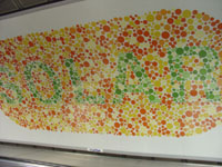
I found a photograph of one of those ads at Flickr. It was taken by Thomas Loudon and I was really puzzled when I saw it the first time. As I am suffering from red-green color blindness I can’t read a single word on none of them.
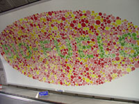
Only asking my wife gives me the answers. They read: SOLAR, BIO-FUEL and WIND. But why on earth should BP use those Ishihara pictures for their campaign which definitely can not be read by us colorblind?
A few hours after sending an email to BP I had an answer. As I understand it, this ads belong to a whole storyboard which starts with some black and white ads showing the words for common energy sources: Oil and Natural Gas.
But they push further into new fields of green power like Solar, Bio-Fuel and Wind. And that’s what they show on the ads you can see here. I still don’t completely understand, why they used Ishihara pictures to pass on their message and therefore we colorblind were excluded. Maybe we should investigate, talk with others, think about it? I don’t know. But to get your own picture of this go ahead and read the answer I received from BP:
Dear Mr. Flück,
Thanks so much for taking the time to write to us about the advertisements you saw on the tube.
First of all, we are sorry that you feel excluded from the messaging of our advertising. We do understand how you feel and we would like to assure you that we have taken — and continue to take — the matter seriously, especially in planning a way forward.
We thought it might be useful to give you the background and the thinking behind this particular campaign. Hopefully, this will shed some light on the way we approached the creative process.
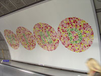
The execution uses black and white patterning in the first few panels (Oil and Natural Gas were spelt out of all the countries BP has visited to secure these sources of energy) – to convey the extent of the Group’s reach to ensure energy security. The latter half used the type of colours and style reminiscent of a medical ‘colour blind test’.
We were sensitive to the fact that some colour deficient people would not be able to distinguish the colour panels and so we interviewed 3 colour-blind men to see if they could comprehend the messaging. We modified the creative accordingly and tried again so that the three interviewees were comfortable that they could understand the copy. A summary slide in normal copy was added to the end of the advert to make sure that the work was branded and the message briefly ‘recapped’ e.g.: ‘ We’re looking to a greener future’. In addition, we inserted the web address www.bp.com, so that consumers needing to better understand BP’s approach to finding greener energy sources would have a more extensive source.
Depending on whether the challenge is red-green colour blindness or blue-yellow colour blindness, the ad should be understood after repetitive sightings. Incidentally, research on these particular sites indicated that people using the travelators at these stations, tend to use them regularly as part of their daily commute. Our intent has been to make the message visually intriguing and compelling – not necessarily digested in just one visit.
We appreciate the opportunity to explain the process and the due diligence we went through to create this particular campaign.
Unfortunately we do not have any images of the poster that we can send to you for your blog.
Again, please accept our apologies for making it hard for you to read the words in some of the panels. Please don’t hesitate to contact us if you need more information or details.
Kind regards,
Dear people from BP, I accept your apologies and thank you for your fast response time.
Pictures taken by Thomas Loudon. Comments are welcome.
An interesting response. It’s certainly an insight into how much thought goes into an advertising project.
I still prefer this explanation.
you are crazy!
i can’t see anything also!
jajaja
kisses from argentina!
malvinas are argentina
That’s just mad! What kind of a statistically viable sample is 3?
It looks like random dots to me too.