New Design for Colblindor

I decided to redesign my weblog because I didn’t like the colors and the fancy style anymore. That’s why I started to look out for a new theme which I could modify to fit my needs.

The new design is simpler and less distracting. I’m not a designer, it’s not perfect but I will try to improve it in the next days and weeks. And of course the different ideas come from different sources of nice and great pages.

Now it’s up to you if you like it also and can get around easily. And if there are some regular readers out there I would like to hear your opinion. Thanks.

T+T83 Telphone Socket Wiring

We are in the midst of renovating our new home. It’s great and exhausting work. But if you can see what you achieved at the end of the day it is just a good feeling.

Just today I finished (momentarily) our office. Some wallpaper work, new painting, new carpet, renovation of the baseboards and some electric work. It took me quite some time to finish all those things but already when I started I had a tough nut to crack.

T+T83 Telephone Socket

I elongated the telephone wire and at the same time I substituted the old telephone socket through a new T+T83 socket. When I started this task I new I’ll get some problems because wires are always color coded. With my color blindness I have problems when something is color coded. I usually need some help which is more often than not my wifes task.

But this time it weren’t only the colors which made me struggle but also the fact that I couldn’t find out how to connect the wires to the telephone socket! It took me more than two hours searching the web until I found a newsgroup entry which could answer my question. So here I want to share my new knowledge about the T+T83 telephone socket.

Code Color
a white
b blue
c turquoise
d violet

In Switzerland a ordinary telephone cable includes four wires a-b-c-d. They can have a whole lot of different colors but the standard and most used are shown in the table on the left. Isn’t this a great choice of colors? Besides the white I couldn’t tell a difference between the others. Next time a telephone standards committee decides on colors a colorblind should be in there too.

T+T83 Socket Schema
T+T83 Socket Schema

The telephone socket T+T83 looks like the diagram on the side. It has six different connecting points numbered 1a, 1b, 2a, 2b, 3a and 3b.

This makes it only one part missing – the connection table. And if you can distinguish the four different wires (!) with the right tools handy the wiring can be done in a few minutes. A nice step by step tutorial how to do the whole job can also be found here.

Socket Wire Color
1a a white
1b b blue
2a c turquoise
2b d violet
3a
3b

Next time it definitely won’t take that long…

Protanopia – Red-Green Color Blindness

Red-green color blindness is split into two different types: Whereas people affected by protan color blindness are less sensitive to red light, deuteranopia or deuteranomly (the second type of red-green color blindness) is related to sensitiveness on green light.

Gender Protanopia Protanomaly
Male 1.01% 1.08%
Female 0.02% 0.03%
Ratios by Gender

Protans have either defective long-wavelength cones (L-cones) or the L-cones are missing at all. If they are missing it is called protanopia or sometimes red-dichromacy. Affected persons are dichromats because they have only two working cone types, short- and medium-wavelength, compared to persons with normal vision with three different cone types.

If the L-cones are defective they appear in different intensities. This results in either a stronger or a weaker color blindness. If L-cones are not missing but defective it is called protanomaly. People suffering from this kind of color blindness are called anomalous trichromats.

Protanopia Color Spectrum

Protans have difficulties to distinguish between blue and green colors and also between red and green colors. When comparing the two spectrums you can see that there are different colors and shades of colors which are hard to distinguish for a protanopic person. So those persons are not only blind on red and green colors but a lot more. This means the well known term red-green color blindness is actually misleading and gives a wrong impression of protan color blindness (and also deutan color blindness).

Protanopia and protanomaly both are congenital color vision deficiencies. Their cause is an unequal recombination in the gene array which is passed on thereafter from parents to their children.

The genes encoding the L-cone photopigments are located on the X chromosome. This chromosome is also called the sex-chromosome, because women have two X’s compared to men with only one X combined with Y chromosome. If something is encoded on the X chromosome it is called sex linked. Sex linked traits are more often observed on men than women because a woman always has a second X chromosome which can compensate the deficiency. This unbalance between men and women can be seen in the table above showing the ratios of each kind of protan color blindness.

Traffic Light
Traffic Light by Jay P.
Some rights reserved.

There are a number of studies which show that color vision deficiencies are a serious risk factor in driving. Particularly protan color blindness reduces substantially the ability to see red lights, regardless of the severity of the defect. Tests showed that protans were very much over-represented in an accident causing group of drivers mostly involving either signal lights or brake lights. Some scientists estimate that being a protan has associated with it a level of risk of road accident that is equivalent to having a blood alcohol level of between 0.05 and 0.08 per cent. Because of that for example in Australia you can’t get hold of a commercial drivers licence since 1994 if you are suffering from protanopia or protanomaly.

Read more about Tritanopia and Deuteranopia—the other two types of color blindness.

Further reading:
Opsin Genes, Cone Photopigments, Color Vision, and Color Blindness
Protan Colour Vision Deficiency and Road Accidents
Wikipedia: Color Blindness

Related articles:
The Biology Behind Red-Green Color Blindness
Colorblind Population
At The Traffic Light

Do Journalists Have A Work Ethic?

About two month ago I was being contacted by Joanna L. Ossinger, a journalist of the online Wall Street Journal. She was on the way to write a review about eyePilot, a software which helps colorblind people. I wrote about this tool earlier this year when it was released the first time (you can read about it here and here).

EyePilot
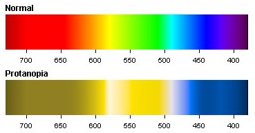
EyePilot could be found in the press a lot. The made it to many news during release time and once again just before school started, because they see it as a helpful tool not only for adults on their everyday work but also for children at school when working with computers. About 8% of men and 0.5% of women are affected by color blindness and this usually from the beginning of their life.

So Joanna contacted me to hear my opinion about the eyePilot and other tools which help colorblind people. I can’t say we had a lively discussion but it went back and forth a few times. I told her my opinion about eyePilot and other tools. In the end I asked her if she would be so kind to mention my weblog or share a link or at least send me the link to the article when it is online.

I never heard again from Joanna.

A few days back I wanted so see if it is maybe already online. I found it right away: Is that Red? by Joanna L. Ossinger, published October 23, 2006.

She didn’t use any of my thoughts – that’s ok.
She didn’t mention my weblog or share a link – that’s ok.
She didn’t send me a link when it was published – that’s not ok at all.

I can live with a lot. I don’t care if she used anything I said or nothing at all. I can understand if she doesn’t mention me or link to my weblog. But what I definitely can’t understand and can’t accept is that she didn’t even send me the link to the article when it was published. Do journalists have a work ethic? And if you can answer this with yes, isn’t it included in the work ethic to inform the people who invested time and shared knowledge, to inform them what is going on?

BeobachterBy the way, a few weeks back I was photographed and interviewed by a journalist on the street. I even had to review my words before they were printed in the magazine. Again I asked if I can get a copy (isn’t this naturally to do so?). But I only had to find out about my colleagues that I was featured in the article including a picture of me. I had to contact the journalist one more time and beg for a copy, which I received just a couple of days ago.

Next time a journalist asks me a favor I will think about it twice!

Vote for ColorLuminator

If you are from Down-Under and haven’t voted yet, go and see http://www.nescafebigbreak.com.au/ and make your choice.

Voting is open till 3rd of November.

You don’t know which chap to support? I already talked about the ColorLuminator and Color Vision for Colorblinds. Ian Cannon invented a nice little handy tool which can read colors. If you need some more information about the ColorLuminator to make your choice I can give some insights from the inventors themselves:

  1. Extensive colour palette – We have divided the RGB colour palette into 729 well-defined divisions and we have researched numerous colour-industry colour charts and major internet sites to assign a suitable colour name for each division. This procedure took over four weeks, for we wanted to make sure that each colour name is universally recognised eg. For the division R-128, G-160, B-96, we had the options of using Nile Green, Paris Green, Asparagus Green, Dull Green, Arcadian Green … We decided upon Asparagus Green as we felt this name conjured up the best image of the specific green colour being described.
  2. LCD display with clear black writing on a light green background, that includes the following details for each colour:
    • color name
    • integral RGB values
    • integral CYMK values
    • integral luminosity, hue and saturation values

    This will allow for more accurate colour matching and laboratory or industrial use if required.

  3. Luminance Contrast – Our device has a small memory which can store the last colour reading. This enables the device to measure the luminosity of two colours and determine the luminosity contrast between these two colours using an algorithm integrated into the device’s software. This has a huge application in the building industry. According to Australian Standard 1428.1 – 2001, all new buildings are required to have a luminance contrast of over 30% for stairways, door frames, signage, large glazed areas, handrails, reception desks and even door handles. Bus bays, train platforms, pedestrian crossings are all required to have tactile indicators with a luminance contrast of over 30%. Even public park benches, bollards and garbage bins must have the same level of contrast.
  4. Currently industry is supposed to use expensive spectrophotometers or colourimeters to determine the luminous values of contrasting surfaces and the analysis of the luminous contrast is conducted back in the office. This is so cumbersome a procedure, that most of the relevant organisations are unable to perform these readings. In recent contact with the two men who chaired the ME64 committee that was responsible for developing the Australian Standard 1428.1, they have expressed deep interest in our project. So much so that they want us to do a presentation at the Association of Access Consultants of Australia AGM in early November 2006. They believe our device would be an ideal instrument for on-site luminance contrast readings. One of the two men is also a member of the ISO (International Standards Organisation) and he taking our recommendations to the international committee for the use of the Australian version of the luminance contrast algorithm to be standardised internationally.
  5. Applications of our device:
    • Builders and restorers can simply match paints, stains and other finishes
    • Luminance contrast can be determined. This is useful for making building and facilities safe for vision impaired, designing web pages, selecting the clearest chalk in a classroom, for the most effective advertising, for signage, for image contrast in aviation helmet displays …
    • Army can quickly produce camouflage clothing for local
    • Gardeners can determine when fruit or vegetables are ripe
    • Colours can be identified at night
    • Colours can be determined in most light sources, eg navy and black are difficult to differentiate under fluorescent lights.
    • Stamp collectors can readily determine different shades of older stamps
    • Profoundly blind can determine colours
    • Colour blind and vision impaired people can readily identify colours. This can be a big problem in Geography where topographic maps have altitudes colour coded and the colours chosen are extremely hard to differentiate.

I hope this is enough to convince you that they really made a great job and need your voice.

Designing with Colors

Designing your weblog or homepage is already quite a challenge. When suffering from color blindness this gets an even bigger task.

Mark Boulton started the series Five Simple Steps to designing with color where he digs into color theory and tries to give some hints how to design your web page using colors correctly.

For me, as one of the colorblind individuals among us, already the first part includes the bottom line: Begin with Gray. When I designed Colblindor I had in mind to show what it means to be colorblind and therefore I worked with colors. But when I think about this now it could be even better starting with gray tones – and maybe even stick to them. This would make it definitely readable to all the colorblind visitors and I wouldn’t have the problem not to see it like others see it.

Maybe this will be the next big thing to do: Go back to basics. But maybe Mark shows us some more interesting tips in the next steps so I’ll stick around to see what I can do to make my weblog more readable to all visitors.