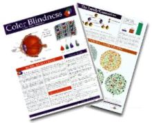
The Color Vision Guide gives you a brief introduction to color blindness on a single sheet of paper. You could also call it a perfect starter for anybody interested in the topic of color vision deficiency.
About 14 years ago John Nash together with his brother and their mother created a guide to educate people about color blindness. He is suffering from green-weakness (deuteranomaly) himself and wanted to share his knowledge with others.
The guide includes the following parts, putting together a well designed sheet of information on color blindness:
Biological background of color vision and its diseases.
Distribution diagrams of the three different color vision deficiencies.
On top of that the Color Vision Guide includes a small set of Ishihara color blindness test plates, which can be used as a basic check for red-green color vision deficiency. Well done.
John is also writing about different aspects of color blindness on his recently created weblog at the Color Vision Store. If you visit him, say hello from Daniel :-)
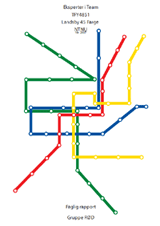
Color blindness friendly coloring of public transport maps.
A group of students from the Norwegian University of Science and Technology decided to make a project work about color vision deficiency. In detail they developed guidelines on how to colorize bus or subway maps taking color blindness into account.
The interdisciplinary group had ten male colorblind test persons and based their findings on the maps of London, Oslo and Trondheim.
First of all the test persons were examined on the type and the severity of their color blindness. That for the students used a set of Ishihara plates and a Lanthony arrangement test.
After that the examination was split into several different tasks like…
…testing which colors look the same to each test person,
…which are the problem areas of the maps,
…and also which colors would the most likely be able to distinguish on a map.
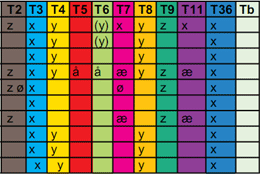
Trondheim Bus Line Colors
The columns of the table to the right show the different bus line colors of Trondheim. The rows are linked to the test persons and the different marks show line colors, which looked the same to the person under test.
It is very interesting to see that firstly, every person had at least one pair of problem colors, and secondly that they are often the same but sometimes can be quite different.
In the end of the report the study group formulates a set of guidelines which should be followed to increase the readability of public transport maps.
Make stylized maps without to much geographical information. This will ease the readability since it makes it more easy to separate the different lines.
Use white frames around the lines since this helps keeping the colors invariable and reduces the confusion when the lines intersect.
Use thick lines. Through this the eye can interpret the color better.
Mark the lines with numbers, especially when the line intersects with others and splits.
Variate the intensity of the colors. The intensity differences are also visible for persons who are colorblind. Choose therefore to use colors with distinct intensity differences. Specially when using similar colors and color combinations, which some people could see as one color. For example:
Brown, red/pink, green
Grey, red/pink, green
Blue, purple, red, pink, green
“Our opinion is that these guidelines will make public transport maps more easily accessible for people with color blindness, and should be possible to implement without reducing the readability for people with normal vision.”
If you are interested the report is available only in Norwegian as PDF download: Fagrapporten.pdf (8MB).
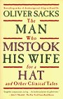
I’ve read it—and couldn’t find any word about this colorblind man. Am I now completely blind? Or did I just pick up a wrong edition of this book?
Anyway, the book includes many interesting stories about very special clinical cases. For example a man who can’t really see the big picture anymore. He sees just tiny little details and can’t put them together anymore like to a see a face. That’s why he mistakes his wife as a hat—a true story.
Despite the fact that The Man Who Mistook His Wife For A Hat by Oliver Sacks didn’t include a story about the colorblind man, it is still worth reading.
Earlier this month Anthony Mitchell from TechNewsWorld wrote a nice article about the usability of products and the communication of information concerning color blindness. Due to the fact that about 8% of men have a color vision deficiency this is nothing to be neglected.
The two parts of the article cover topics like good contrast colors, presenting with color blindness in your mind, color coding, and poor usability through bad color choices.
A few statements caught my attention which I would like to point out:
Information should never be distinguished by color only. This is a very important point which is often forgotten about. Only three different colors with high contrasts are easily distinguishable for colorblind persons. Always try to make not only color the only attribute but also use patterns, thickness of lines or borders or simply label the different parts directly if possible.
Colorblind people have trouble seeing light from red laser pointers. Laser pointers always give me a hard time. If they are used on presentations I have great difficulties to see the little dot. Often I concentrate so much on the red dot that I even loose track of the presentation itself.
Rely on black fonts and white backgrounds. It’s so simply why don’t you stick to it? Of course this is not true in all cases but for a text which should be easily readable for everybody just stick to black and white.
Colorblind people can find it impossible to distinguish red letters from black ones. This point is sometimes hard to believe by somebody with normal color vision. But red text doesn’t stick out at all if you are colorblind. If you use red text to show some errors for example in an input form invert the colors, make it bold, print a border or just do anything to make it more visible.
Distinguishing colors and naming colors are separate tasks. When it comes to naming colors I’m really bad. And with really bad I mean really really bad. I can distinguish colors but usually have big problems naming them. Color blindness makes you a color names guessing individual and not knowing one.
The article also includes a whole lot of links to better and worse examples: colors used in icons, webpages, links, and a lot more.
Maybe one or the other tip can help you to present your products more colorblind friendly or get your point across easily even with colorblind persons in your audience. You can find the whole article by following the two links below.
Murli of d’zynovation pointed out in a recent comment the book The Man Who Mistook His Wife For A Hat: And Other Clinical Tales by Oliver Sacks. As being a neurologist he writes books as some kind of science novells. This particular book describes some clinical tales whereof one is about an architect and artist who loses his ability of color vision through a knock on his head.
As this description sounds very interesting to me and because I didn’t buy a book for quite a long time I just surfed over to Amazon and ordered the book. I’m looking forward to find out more about our protagonist exploring color blindness. I will post my impressions in a future article.
There are not many books who try to explain the phenomenon of color vision deficiency. Arlene Evans wrote two of them to support the understanding and get a better grip on this topic.
Seeing Color: It’s My Rainbow, Too is trying to explain color blindness to kids and is therefore definitely the one and only book in this area. There are as many kids colorblind as adults and this is often not recognized until school time. Kids can read this book to find out what is different in their vision compared to others. It is also a good resource for school teachers and shows which pitfalls have to be avoided.
The other book is called Color is in the Eye of the Beholder and written for teens and adults. This one goes into further details about color blindness and even complete color blindness as known as Achromatopsia.
If you want to learn more about the books of Arlene Evans and what she is up to go and visit her homepage about Color Vision Deficiency (CVD). She even wrote some very interesting introductional articles about color blindness including “real life stories” of some colorblind guys.