
A group of students from the Norwegian University of Science and Technology decided to make a project work about color vision deficiency. In detail they developed guidelines on how to colorize bus or subway maps taking color blindness into account.
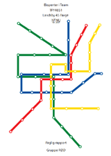
The interdisciplinary group had ten male colorblind test persons and based their findings on the maps of London, Oslo and Trondheim.
First of all the test persons were examined on the type and the severity of their color blindness. That for the students used a set of Ishihara plates and a Lanthony arrangement test.
After that the examination was split into several different tasks like…
- …testing which colors look the same to each test person,
- …which are the problem areas of the maps,
- …and also which colors would the most likely be able to distinguish on a map.
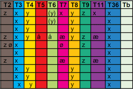
The columns of the table to the right show the different bus line colors of Trondheim. The rows are linked to the test persons and the different marks show line colors, which looked the same to the person under test.
It is very interesting to see that firstly, every person had at least one pair of problem colors, and secondly that they are often the same but sometimes can be quite different.
In the end of the report the study group formulates a set of guidelines which should be followed to increase the readability of public transport maps.
- Make stylized maps without to much geographical information. This will ease the readability since it makes it more easy to separate the different lines.
- Use white frames around the lines since this helps keeping the colors invariable and reduces the confusion when the lines intersect.
- Use thick lines. Through this the eye can interpret the color better.
- Mark the lines with numbers, especially when the line intersects with others and splits.
- Variate the intensity of the colors. The intensity differences are also visible for persons who are colorblind. Choose therefore to use colors with distinct intensity differences. Specially when using similar colors and color combinations, which some people could see as one color. For example:
- Brown, red/pink, green
- Grey, red/pink, green
- Blue, purple, red, pink, green
“Our opinion is that these guidelines will make public transport maps more easily accessible for people with color blindness, and should be possible to implement without reducing the readability for people with normal vision.”
If you are interested the report is available only in Norwegian as PDF download: Fagrapporten.pdf (8MB).
See also: Japan’s Public Facilities Making Life Easier for Colorblind and Subway Maps in general.
The issue of colour sets for maps has been very fully handled by Cindy Brewer, easily Googlable (you’ll end up at my site).