
This is the second of three parts on the color blindness test based on the confusion lines of the CIE 1931 color space. In this part of the trilogy I would like to introduce you the confusion lines of the CIE 1931 color space, which was introduced in part one.
The CIE 1931 color space, which is two-dimensional, reflects only hue and saturation, which make up together chromaticity. The third dimension – lightness – is not shown in the diagram. But this doesn’t really matter, because many considerations of colors don’t need lightness. When looking at confusion lines we also don’t need the third dimension and therefore, they can be shown very nicely on the chromaticity diagram.
Let us have a look at some historical facts about confusion lines:
- In 1855 J. C. Maxwell said: “Find two for a colorblind undistinguishable colors. Mark them on the CIE diagram and draw a line through them. This line will connect all colors which can’t be told apart by the colorblind person. You then can find more lines and all of those lines are either parallel or meet in a single point.”
- A. König analyzed in 1892 the confusion lines and the so-called intersection point (also called co-punctal point) on three persons affected by color blindness.
- In the year 1935 F. H. G. Pitt did some further research and found the confusion lines and corresponding intersection points for protanopic and deuteranopic persons.
- D. Farnsworth (1955) and L. C. Thomson & W. D. Wright (1953) completed the work by adding the results for tritanopic persons.
Many studies followed and up to today these confusion lines are the main source while constructing tests on color blindness.
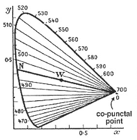
If you have a look at the diagram on the right side you can see the confusion lines associated to protanopic (red-blind) persons. The colors connected by one line can’t be distinguished by a protanope. If you would draw another line through the co-punctal point (intersection point), all colors on that line would look the same to a red-blind person too.
You can also see that there is a line going through a point called W. This is the so called white-point. Of course white can be told apart from red, even by a colorblind. But we have to take into account that the chromaticity diagram doesn’t include lightness. This means all colors along a line need the correct lightness adjustment to be undistinguishable by each other. Otherwise a colorblind can see a difference evenso it would be only a difference in brightness and not a different color perception.
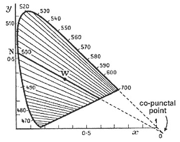
The diagram of lines for deuteranopes (green-blind) looks quite the same as for protanopes. Both types of color blindness share a strong confusion on red and green colors, therefore the name red-green color blindness.
You can also see, that the lines are not exactly the same. Especially the intersection point is outside the range of the visible colors.
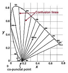
The last diagram looks totally different. The shown lines are connecting undistinguishable colors for tritanopes (blue-blind). Because the intersection point is at the blue end of the color spectrum, the color perception is completely different to the ones of red- or green-blind persons.
When you have a close look at all three diagrams you can also see, that the count of confusion lines differs. This is due to the following fact: Each line shows the smallest difference between distinguishable colors. This means not only the colors on one line, but all the colors between two lines are undistinguishable by persons affected by a certain type of color blindness.
In numbers:
- People with normal vision can differentiate 150 wavelengths of colors.
- Red-blind persons can see around 17 different wavelenghts.
- Green-blind persons are able to distinguish around 27 wavelengths.
- Blue-blind persons have an even more restricted visual field in the color spectrum.
By the way: Confusion lines are also called isochromatic lines, because they show lines of the same color (to the colorblind). A more accurate term would be pseudo-isochromatic lines, which is often used in academical papers.
In part three of this series, which will be the last part, we will have a look at the color blindness test based on these lines
Further readings:
Fundamental Studies Of Color Vision from 1860 To 1960
The Perception of Color
This is the second part about the color blindness test based on confusion lines of the CIE 1931 color space. The first part can be found at: CIE 1931 Color Space and the last part at: Color Blindness Test based on Confusion Lines of the CIE 1931 Color Space.
Pingback: .colblindor « fin.
Is it possible to be “purple blind” ? I cannot differentiate between blue and purple for the life of me. Barely, sometimes. I’m 15 years old and only discovered this yesterday. The eye doctor two years ago told me I was in perfect working condition with 20/20 vision. My friends have this theory that I grew up seeing people call this periwinkle-washed-out-blue color “purple” and so I called it purple too. I can see red and green and yellow all just fine. I’m only affected with blues, purples, and certain pinks. But according to this site the closest thing to me is tritanopia, and they have the most limited vision. I seem to have a much wider range than that.
Jordan, it’s not really about the name, but there are really just three different main types of color blindness.
Check my series on Color Blind Essentials to learn more about the different types and available tests.
– Daniel
Pingback: Designing accessible color spectrums Joshua Tauberer’s Blog
Jordan, you probably have protanomaly