And again. I changed the design of Colblindor again. Why? Because I already didn’t like the old one anymore and it was cluttered and not really expandable.
This time I switched to a theme, which I didn’t have to change much. Just simple and nice. I hope you like it too. Maybe I am a bit change addicted and should better put some more effort into good content than changing the parameters of this blog all the time. But that’s the way I work…
I have a drivers license for more than ten years now. When I applied for it I didn’t had to take a color blindness test. This is maybe the reason why I have one…
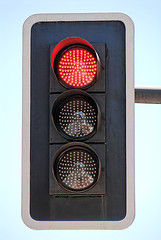
The question most people think about when they hear, that someone who is colorblind and does have a drivers license is: “How do you know when to stop at the traffic light?” And they don’t stop thinking here but start to find a reason themselves.
People conclude that if you are colorblind you know, red is on top, green at the bottom and that’s the way colorblind people find their way through the traffic jungle. But that’s wrong.
Why is it wrong?
The association between top and stop, bottom and go is to weak.
The connection for deciding what to do is not fast enough.
The thought needs to many steps. Light – top – stop is one step to much.
So what do you do if you are colorblind?
Colorblind doesn’t mean you can’t see colors at all. You can see colors, differences in hue, saturation and lightness. Maybe not as good as with normal vision, but you definitely have a broader vision than just black, white and gray. And because of that, people suffering from color blindness do see different colors at the traffic light. Some more differences, some less and maybe not the same difference in color as people with normal vision. But all you have to learn is which color you see relates to which reaction.
If you are colorblind you know this color means stop and that color means go. You don’t know the name of the color. You maybe can’t relate the colors you see at the traffic light with other colors in the nature. You even may give them other names. But you will always know the difference because you can see a difference.
If you are not affected by color blindness I suppose all this is hard to imagine. Have a look at some pics and help your imagination. Some pics are about Walk – Don’t Walk pedestrian lights, modulated to show different color vision deficiencies.
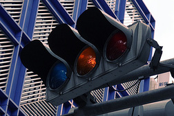
By the way, there are many traffic lights not only from top (red) to bottom (green) but from left (red) to right (green). If you would just remember the sides, you definitely would mix them up all the time.
This is the third and last part of a series, where we have a closer look at a color blindness test which is based on the confusion lines of the CIE 1931 color space. In the first part I introduced the CIE 1931 Color Space and the second part was looking a bit deeper into the theory of Confusion Lines.
Most tests which check for color blindness are based in some way on confusion lines. But I would like to focus your attention on this test which is regenerated for every single trial based only on confusion lines.
The author of the test describes the design for his color vision test as follows:
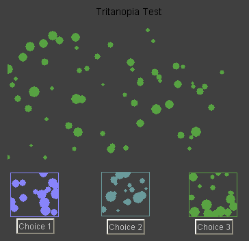
For each color vision deficiency (protanopia, deuteranopia or tritanopia) test, five confusion lines are selected randomly. Three points on each confusion line that can be distinguished by the normal observer are chosen.
For each test, a confusion line is selected randomly. A point is selected randomly among the set of three. It is displayed in the upper test panel at a random luminance in the form of random dots. The three points are displayed in the lower three panels at a random luminance and also in the form of random dots.
The subject is asked to check one of the lower panels which color matches that of the test panel.
Color Blindness Test – Example Screen
As I described in part two of this series, colorblind people can distinguish only a handful of wavelengths of the color spectrum. Compared to normal vision it is around 10% to 20%. But if you are affected by color blindness you automatically start to interpret a difference in lightness as a different color. This makes you think to see more colors than you actually can distinguish.
If we look at the description of this color blindness test this is exactly the point of it. It plays with the lightness and adjusts the three choices to the same lightness, which makes it really hard to get the match if you are colorblind.
I took the test. It showed me cruelly – cruelly again, that I am very much colorblind. But let us have a look at my results. I took each color blindness test three times and completed each time 50 decisions. What is amazing to me is, that in all three tests the results didn’t differ a lot, or better said almost none. Let me start with the best results:
My Tritanopia test results
Run
Correct
Wrong
Correct%
1
47
3
94%
2
49
1
98%
3
47
3
94%
Most of the time I could tell a difference between the three choices. But still I had to guess every single time. I suppose the problem is that I can’t name the colors I see, I just see different colors and nothing more. (→ Tritanopia Test)
My Deuteranopia test results
Run
Correct
Wrong
Correct%
1
31
19
62%
2
30
20
60%
3
35
15
70%
The results are much worse compared to the first test. Although I still could distinguish usually one of the three colors from the other two it was more of a guessing game than really knowing anything. (→ Deuteranopia Test)
My Protanopia test results
Run
Correct
Wrong
Correct%
1
26
24
52%
2
24
26
48%
3
25
25
50%
This color blindness test was pure guessing. I couldn’t tell a color from the other and I am very much amazed of the results. The lightness adjustment made it impossible to me to match them correctly. (→ Protanopia Test)
The results of this color blindness test in three parts approve the outcomes of other tests. I am protanopic or at least affected by a very strong protanomaly and as the doctor would say: “You are completely colorblind.”
More information about the color blindness test based on confusion lines and the online tests itself can be found at the Color Vision page of biyee.
The newest Tangled Bank is up and running. It’s already number 72 – and counting. This time featured by Chris at his blog Ouroboros (research in the biology of aging).
Tangled Bank #72 is called: What’s in a name? and listens a whole lot of interesting articles about “science and medicine, broadly defined”.
There are even a few other posts around the topic color – broadly defined:
This is the second of three parts on the color blindness test based on the confusion lines of the CIE 1931 color space. In this part of the trilogy I would like to introduce you the confusion lines of the CIE 1931 color space, which was introduced in part one.
The CIE 1931 color space, which is two-dimensional, reflects only hue and saturation, which make up together chromaticity. The third dimension – lightness – is not shown in the diagram. But this doesn’t really matter, because many considerations of colors don’t need lightness. When looking at confusion lines we also don’t need the third dimension and therefore, they can be shown very nicely on the chromaticity diagram.
Let us have a look at some historical facts about confusion lines:
In 1855 J. C. Maxwell said: “Find two for a colorblind undistinguishable colors. Mark them on the CIE diagram and draw a line through them. This line will connect all colors which can’t be told apart by the colorblind person. You then can find more lines and all of those lines are either parallel or meet in a single point.”
A. König analyzed in 1892 the confusion lines and the so-called intersection point (also called co-punctal point) on three persons affected by color blindness.
In the year 1935 F. H. G. Pitt did some further research and found the confusion lines and corresponding intersection points for protanopic and deuteranopic persons.
D. Farnsworth (1955) and L. C. Thomson & W. D. Wright (1953) completed the work by adding the results for tritanopic persons.
Many studies followed and up to today these confusion lines are the main source while constructing tests on color blindness.
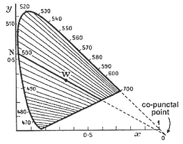
Confusion Lines – Protanopia
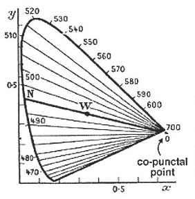
If you have a look at the diagram on the right side you can see the confusion lines associated to protanopic (red-blind) persons. The colors connected by one line can’t be distinguished by a protanope. If you would draw another line through the co-punctal point (intersection point), all colors on that line would look the same to a red-blind person too.
You can also see that there is a line going through a point called W. This is the so called white-point. Of course white can be told apart from red, even by a colorblind. But we have to take into account that the chromaticity diagram doesn’t include lightness. This means all colors along a line need the correct lightness adjustment to be undistinguishable by each other. Otherwise a colorblind can see a difference evenso it would be only a difference in brightness and not a different color perception.
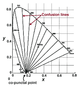
Confusion Lines – Deuteranopia
The diagram of lines for deuteranopes (green-blind) looks quite the same as for protanopes. Both types of color blindness share a strong confusion on red and green colors, therefore the name red-green color blindness.
You can also see, that the lines are not exactly the same. Especially the intersection point is outside the range of the visible colors.
Confusion Lines – Tritanopia
The last diagram looks totally different. The shown lines are connecting undistinguishable colors for tritanopes (blue-blind). Because the intersection point is at the blue end of the color spectrum, the color perception is completely different to the ones of red- or green-blind persons.
When you have a close look at all three diagrams you can also see, that the count of confusion lines differs. This is due to the following fact: Each line shows the smallest difference between distinguishable colors. This means not only the colors on one line, but all the colors between two lines are undistinguishable by persons affected by a certain type of color blindness.
In numbers:
People with normal vision can differentiate 150 wavelengths of colors.
Red-blind persons can see around 17 different wavelenghts.
Green-blind persons are able to distinguish around 27 wavelengths.
Blue-blind persons have an even more restricted visual field in the color spectrum.
By the way: Confusion lines are also called isochromatic lines, because they show lines of the same color (to the colorblind). A more accurate term would be pseudo-isochromatic lines, which is often used in academical papers.
In part three of this series, which will be the last part, we will have a look at the color blindness test based on these lines
This little test is not really to test your color blindness but give it a try – maybe with a smile on your lips. I guarantee you will get the 100% after a few trials, no matter how severe your color blindness is. Try it out at:
I would like to introduce a color blindness test based on the confusion lines of the CIE 1931 color space (also known as CIE XYZ color space). Because the topic is not the easiest one and needs some explanation I would like to split it into three parts. In this first of three parts I will introduce the CIE 1931 color space. In part two and three which will follow next week I will talk about the confusion lines of the CIE 1931 color space and last but not least the color blindness test based on the CIE 1931 color space confusion lines.
CIE 1931 Color Space
The acronym CIE stands for International Commission on Illumination which is the international authority on light, illumination, color, and color spaces. And 1931 is the year of birth of this specific color space.
Where it all began
Let us go back into history and have a look at where it all began. Based on the research on wavelengths and colors of Thomas Young at the turn of the 19th century, Hermann von Helmholtz developed around fifty years later a color theory. He stated, that the human eye has three different types of color receptors (cones) and that every color we perceive is a mixture of signals of those three types of cones, which roughly reflect the three different colors red, green and blue.
In the roaring twenties of the last century two scientists (W. David Wright, John Guild) took up this theory and independently made some experiments. To find out more about the three-color-theory a setup with four colored lights on two different sides was used.
On the left side a test color was projected by a light source.
On the right side the observer had three adjustable light sources (red, green and blue).
Now each observer (also called CIE standard observer) had the task to adjust the three lights accordingly, that the color on the right hand side was exactly the same as the test color on the other side. After many tests with a lot of test persons the results were mathematically analyzed. This produced three different curves of intensity for each light source to mix all colors of the color spectrum.
Funnily enough not every color could be matched and sometimes some red had to be added to the test color to get a correct match. This was also taken into account of the mathematical equations and resulted in a red curve including negative values. These three curves were standardized and are called the CIE RGB color matching functionsr, g and b.
CIE RGB to CIE 1931
Because mathematicians don’t like negative numbers if they can change it, the commission changed it. Based on the CIE RGB functions and their corresponding values, new functions were calculated. Those new functions called x, y and z had to fulfill a list of conditions. Some of them were:
The new functions must be everywhere greater or equal to zero.
The y function describes only the luminosity.
The white point is, where x = y = z = 1/3.
All this put together produced the well known CIE XYZ color space which is also known as CIE 1931 color space. This color space aims to describe all visible colors to the human eye and can be shown as a three dimensional cube.
Projection
Because three dimensional objects can’t be illustrated very well a two dimensional representation had to be found. The Y parameter of the so-called tristimulus values X, Y and Z is a measure of the brightness. This helped to easily calculate the new chromaticity values x and y by the following rules:
x = X / (X + Y + Z)
y = Y / (X + Y + Z)
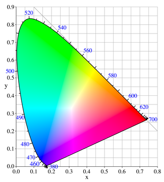
The corresponding chromaticity diagram is shown in the above picture. The outer curved line is called spectral locus and corresponds to the well known color spectrum, shown with corresponding wavelengths. The straight line on the lower part between blue and red is called purple line. This line relates to all colors which can only be mixed up by blue and red which are not part of the color spectrum.
In the next part I will talk about the confusion lines of the CIE 1931 color spectrum. And this leads us to the final part about the color blindness test based on those confusion lines.
Most people connect the term color blindness to blindness and color, which tells them, that if you are colorblind you can see only black and white or maybe grayscale pictures. Only when they talk to somebody who really is colorblind or read something about color blindness, they find out, that they are wrong.
Color blindness is just the most common term for describing all different types of vision conditions which relate to a less broader color spectrum. If you are affected by color blindness you can see less colors than a “normal” human being but not none.
If we have a look at the terminology there are three different well known terms to describe this disability:
Color Vision Deficiency: This is the most accurate term. It is mostly used in scientific papers or from doctors. It describes the actual handicap to the point but it is not well known in common speech.
Daltonism: This term is derived from the 18th century researcher John Dalton. Himself colorblind he did some investigations and described the phenomenon for the first time in a scientific paper. The naming is still used in some languages and is also related to all types of color vision deficiency.
Color Blindness: This is the most common term although it is misleading. Maybe it made the run in common speech because it’s just easier to say “he is colorblind” than “he has a color vision deficiency”.
All three terms relate to the same phenomenon: People or animals who can’t see colors as “normal” human beings can see colors.
Maybe we need to have a quick look at how a “normal” human being actually can see. If you are not suffering from a color vision deficiency, you have three different cone types inside your eyes. Each of this has a special color spectrum it relates to and sends signals to the visual system. All three signals, which can be stronger or weaker, are mixed up to one distinct color inside your visual system.
If you are colorblind usually there is something wrong with one of those different cone types. Either they are faulty or missing at all. This means you still can see colors but less. Maybe less diverse, less shades, less colors and definitely less colorful. But not to be mixed up with a black&white picture. Those are only grayscale pictures or looked at it differently – brightness pictures.
Colorblind people can see colors. They can see blue and violet, green and yellow, red and orange and a lot more. Maybe just a bit less colorful here and a bit less colorful there, which makes them having bigger problems to distinguish colors. But anyway, they definitely can see colors.