At Cynical Chatter From The Underworld the Morningstart talks in a recent post about his living with color blindness and its implications. Suffering from color blindness not only follows him in his daily living, most notably during the childhood, but also restricted his choose of profession. He ends with a very nice quote whereas I take the liberty to reproduce it at this place.
The question is not just how to make the blind see, but how the blind can explain so that the sighted can see as well.
Aaron talked at his blog In Leftfield about being colorblind and how your children can easily outpace you. He also mentions his purple tennis shoes which I think is a very nice committment to color blindness :-) And as his last point he quotes how each wife can support her colorblind husband.
Mike works up just yesterday his color blindness in his journal I’m Going Sane in a Crazy World. He posted three posts in a row about it: Color Blind, Color Blind 2 and Color Blind 3. I like the Ishihara picture in the last post because I also can’t see a sh**. But he talks about fruits which are synonyms for colors and children who try to teach you the colors. Of course – I mean if you can’t them by now you have to learn them finally – it is as simple as this.
And also Steve Pallina writes about his color blindness in a not so recent post from last may. It was followed by some very interesting posts about being colorblind, computer colors and tetrachromats.
I suppose there are many many more colorblind people in the blogosphere and writing about it. I’ll definitely do a follow up on this.
This man showed us how to get a great photographer even if you don’t have a sense for colors. I suppose he wasn’t colorblind, but a purple jacket with orange pants – even I wouldn’t dare to show up in such clothes.
Being colorblind and testing your personality through a ColorQuiz, I thought this could maybe give me some special insights into my soul.
Taking the test is as easy as winking: They show you eight squares in eight different colors, where I have to say for my eyes the colors were not at all colors I associate with my psyche. But anyway, you have to choose the order of the colors, starting with the one you like most and click them away one after the other. If you are done you have to do the same again with the same colors. They are only shown in a slightly different order. The big clue is: You have to wait for three minutes before you accomplish the second round of color clicking. I nominate those three minutes to todays most boring minutes.
When you are done they show you a very detailed view of your personality. My one looked like the following:
Your Existing Situation
Sensitive and understanding but under some strain; needs to unwind in the company of someone close to him.
Your Stress Sources
Wishes to be independent, unhampered, and free from any limitation or restriction, other than those which he imposes of himself or by his own choice and decision.
Your Restrained Characteristics
Unhappy at the resistance he feels whenever he tries to assert himself. Indignant and resentful because of these setbacks, but gives way apathetically and makes whatever adjustments are necessary so that he can have peace and quiet. Egocentric and therefore quick to take offense. Sensitive and sentimental, but conceals this from all except those very close to him.
Your Desired Objective
Feels that there is little prospect of achieving his hopes and therefore surrenders himself to a life of sensuous ease, free from any problems.
Your Actual Problem
Seeks security and a position in which he will no longer be troubled by demands being made on him.
This raises the question: Is it allowed to take this test even if you are suffering form color blindness? Or does this tamper the result? If I look at the results I think they don’t fit at all. So the big question is: Can this be tracked back to my color blindness or is this test just to simple and superficial?
Personally I think the test is based on an oversimplifed pattern. Different colors affectations don’t deduce different types of personality. I think every person grows up in a environment stamped by colors and this pertinents the liking and therefore the order of colors you choose in the ColorQuiz test. Color blindness pushes this problem even further because the colors appear to a colorblind person differently than to a person with no color vision deficiency. Some colors may be almost glowing for your eye but look completely pale to my ones. My conclusion is: It was fun to try it but the outcome is worth nothing.
Maybe you colorblind and not so colorblind fellows out there could help me out. It takes only a few minutes to make up your mind. But take caution, the chosen colors are truly awful.
Yesterday was St. Patrick’s Day. And as I learned from the blog community people are ‘obligated’ to wear something green, otherwise they get kicked in the ass. From Jeff we can learn some more about being colorblind and St. Patrick’s Day.
I am glad we don’t celebrate St. Patrick’s Day in Switzerland. Otherwise I definitely would have the same problems. Maybe I would once go and shop a green shirt and mark it all over with: This is green; wear me for St. Patrick’s Day; open your eyes stupid, I am GREEN. Maybe this could help. – Oh man, I need a green beer now.
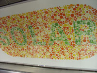
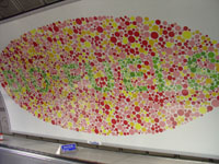
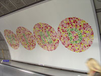
BP recently had an advertisement campaign going on at Waterloo Station, London. The used some Ishihara pictures to deliver their message.
I found a photograph of one of those ads at Flickr. It was taken by Thomas Loudon and I was really puzzled when I saw it the first time. As I am suffering from red-green color blindness I can’t read a single word on none of them.
BP ad BIO-FUEL
Only asking my wife gives me the answers. They read: SOLAR, BIO-FUEL and WIND. But why on earth should BP use those Ishihara pictures for their campaign which definitely can not be read by us colorblind?
A few hours after sending an email to BP I had an answer. As I understand it, this ads belong to a whole storyboard which starts with some black and white ads showing the words for common energy sources: Oil and Natural Gas.
BP ad WIND
But they push further into new fields of green power like Solar, Bio-Fuel and Wind. And that’s what they show on the ads you can see here. I still don’t completely understand, why they used Ishihara pictures to pass on their message and therefore we colorblind were excluded. Maybe we should investigate, talk with others, think about it? I don’t know. But to get your own picture of this go ahead and read the answer I received from BP:
Dear Mr. Flück,
Thanks so much for taking the time to write to us about the advertisements you saw on the tube.
First of all, we are sorry that you feel excluded from the messaging of our advertising. We do understand how you feel and we would like to assure you that we have taken — and continue to take — the matter seriously, especially in planning a way forward.
We thought it might be useful to give you the background and the thinking behind this particular campaign. Hopefully, this will shed some light on the way we approached the creative process.
The execution uses black and white patterning in the first few panels (Oil and Natural Gas were spelt out of all the countries BP has visited to secure these sources of energy) – to convey the extent of the Group’s reach to ensure energy security. The latter half used the type of colours and style reminiscent of a medical ‘colour blind test’.
We were sensitive to the fact that some colour deficient people would not be able to distinguish the colour panels and so we interviewed 3 colour-blind men to see if they could comprehend the messaging. We modified the creative accordingly and tried again so that the three interviewees were comfortable that they could understand the copy. A summary slide in normal copy was added to the end of the advert to make sure that the work was branded and the message briefly ‘recapped’ e.g.: ‘ We’re looking to a greener future’. In addition, we inserted the web address www.bp.com, so that consumers needing to better understand BP’s approach to finding greener energy sources would have a more extensive source.
Depending on whether the challenge is red-green colour blindness or blue-yellow colour blindness, the ad should be understood after repetitive sightings. Incidentally, research on these particular sites indicated that people using the travelators at these stations, tend to use them regularly as part of their daily commute. Our intent has been to make the message visually intriguing and compelling – not necessarily digested in just one visit.
We appreciate the opportunity to explain the process and the due diligence we went through to create this particular campaign.
Unfortunately we do not have any images of the poster that we can send to you for your blog.
Again, please accept our apologies for making it hard for you to read the words in some of the panels. Please don’t hesitate to contact us if you need more information or details.
Kind regards,
Dear people from BP, I accept your apologies and thank you for your fast response time.
Pictures taken by Thomas Loudon. Comments are welcome.
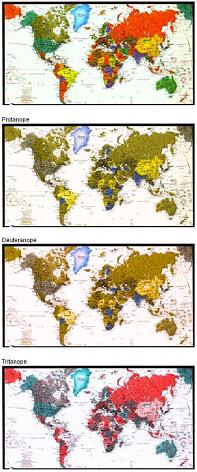
This pictures try to show how the earth, the world, our globe, our planet or at least a picture or a map of it are seen by people with some kind of color blindness.
Color blindness is spread everywhere. In every hemisphere, in every continent, in every country, in every district, in every town almost in every family you can find somebody with some kind of color vision deficiency.
The eyes are for most of us the main tool to accomplish everyday life. And there are so many under us who don’t have the same view as we. Everybody looks at things different. How can we be sure that we even talk about the same colors when we name them?
But let’s face it, if we wouldn’t have this small differences, handicaps and advantages it would be boring. The world be an indistinguishable mass of the same individuals, how boring.
Nothing to google up – nothing to say. Nothing to talk about at the bar and nothing to laugh about (What? You can’t see that!).
Isn’t it beautiful, our planet? Even without all the colors – it’s just colors.
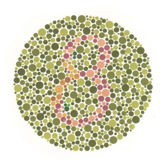
The Ishihara Color Blindness test – named after a Japanese Professor at the University of Tokyo – is the most well known tool to test for red-green color blindness. Mr Ishihara developed this test almost 100 years ago. It was first published in 1917 and is used since then to check if someone is suffering from protanopia or deuteranopia, the two different kinds of red-green color vision deficiencies.
A collection of 38 plates filled with colored dots build the base of this test. The dots are colored in different shades of a color and a number or a line is hidden inside with different shades of an other color. But enough theory, take the color blindness test by Mr Ishihara yourself and be surprised (or not) of the result.
The above link showes the so called small test. The small test consists of 24 different plates (or cards) and the large test of 38. The plates follow a setup of four different test designs:
Transformation plates – anomalous colour observers give different responses to colour normal observers. [Plates 2-7]
Disappearing digit (Vanishing) plates – only the normal observer is meant to recognize the coloured pattern. [Plates 9-13]
Hidden digit plates – only the anomalous observer should see the pattern. [Plates 14-15]
Qualitative plates – intended to classify protan from deutan and mild from severe anomalous colour perception. [Plates 16-23]
Ishihara Plate
It has to be mentioned, that tests like this one are never 100% accuarte. This is due to the two following facts: First of all, every computer monitor has its own color correction. So it never can be guaranteed that the seen colors are really the colors which should be seen. This can falsify the results. And second, easily put there can always be some false positives. This test can therefore not be considered as a medical test for color blindness.
Now let’s have a look at the outcomes. I will show you my results and you can, if you like, compare them with your own ones:
CARD 1: 12. Of course, everybody should see that.
CARD 2: 3 with a slight shade of an 8.
CARD 3: A very confuse 29.
CARD 4: Some dot clusters, that’s all.
CARD 5: A slight circle at the top.
CARD 6: Some dots here, some there.
CARD 7: Dots everywhere.
CARD 8: Nothing. I mean, I can see the big circle full of little colored circles, but that’s all.
CARD 9: Nothing.
CARD 10: Nothing.
CARD 11: Nothing.
CARD 12: Nothing.
CARD 13: Nothing.
CARD 14: Some lines and clusters but no number.
CARD 15: More lines and dot clusters.
CARD 16: I would say a 6 on the righthand side.
CARD 17: 2, righthand side.
CARD 18: A blue (?) line more at the bottom of the circle.
CARD 19: Two crosses. One on the left and the other on the right side of the circle.
CARD 20: Many colorful dots.
CARD 21: More colors and more dots.
CARD 22: Some kind of inner circle with three gaps.
CARD 23: There is a line, but it has huge gaps in between.
CARD 24: I can see that one…
If I try to make a conclusion out of my views I would say I am suffering something between strong protanomalia, protanopia and complete color blindness. Yes, I knew it before and I know it even better now: I am colorblind. But at least I could spot the first and the last plate easily.
I remember this story as the first time I really realized that my vision of colors is different to others. I suppose I knew before that I was suffering from color blindness, but I couldn’t really classify it until this morning at school. It was the my second year at primary school and we were painting with water colors. I am not a great painter, neither I was at that time but I colored a nice landscape. Some hills and grass, maybe a house, the sun, everything was nice and colorful until, yes until I started to fill in the sky.
Blue, of course it had to be blue. And what a nice blue I mixed together. So I started painting on one side making my way to the middle of the picture. Suddenly an other child stopped by started giggeling and pointed at my sky color.
Yes, what a shame, it was all pink.
I really felt ashame. How could I possibly mismatch those two colors? I tried to cover the messed up part of my picture but it didn’t really work out. So my sky was blueish-pinkish. Great. I remember that I couldn’t stand it that I colored this last part of my painting just with a completely wrong color. Color blindness simply presented on an otherwise wonderful piece of art. Now I even could make out the difference. As soon as they told me, I could see that I have chosen the wrong color. But it was to late, to late to fix it. What a shame.
Is color blindness something to be ashamed of? You say no; I say no but sometimes I just feel so. Ashamed of not being able to tell if it matches or if something is of the right color or just choosing the wrong color and everybody can see it and then – afterwards – I realise it too. My color blindness I think is nothing to be ashamed of but sometimes I just am.
As very interesting described in the blog entry of Ginny the colorblind italian astronomer Schriparalli influenced the history of Mars very much. The interesting part of this story is that he was suffering from a red-green color blindness. According to the mentioned article this was the reason, that he couldn’t distinguish some light shadings and missinterpret this. He was describing Mars in terms of ‘land’ and ‘sea’ and this missleading sights made him describe the view of ‘canali’ on the surface of the planet Mars. ‘Canali’ was translated to ‘canal’ and therefore something human made. This kicked off the missbelieves and dreams of intelligent living on Mars. The correct translation would have been ‘channels’ or ‘grooves’ which is something completely natural.
So a colorblind man inspired the world to dream of intelligent beings outside the earth and I think this is still in our minds and keeps going on. This story tells me that even if people are suffering from color blindness this is for a good reason. A reason we maybe don’t realize in our daily living and which usually only gives us trouble. But I know now that there is a reason for it and we only have to find this reason and make it public to other people so they can share those insights with us.
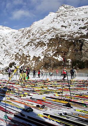
Today is the day of Engadin Skimarathon. Every second sunday in march this cross country skiing race takes place in the wonderful Engadin, Switzerland. Up to 13’000 athlets are fighting for glory and personal best time at this magnificent race.
Startfield at Engadin Skimarathon
The ambitious participants show up at six o’clock in the morning to put down their skis. Before that it is not allowed and afterwards you could miss a good spot for the start. So what do you do from six o’clock till the start between 8h40 and 9h20?
An even more intersting question is: how can you find your pair of ski again before the race starts? There are uncoutable pairs in many rows lined up. And the best of all: They all look the same. Yes, really. Either they are yellow, silver or red. That’s about it. So for this time it is not only the colorblind under us which have to search but everybody. Therefore many participants choose some tricks to better find their skis again. This includes putting up their poles and attaching ballons.
And what if you can’t find your skis? Then your pulse will be higher up than during the whole race afterwards. You see many people either walking around with a terrified view or others waving with lonely pairs of ski. Anyway, in the end everybody grabs a pair, hits the snow and tries to survive the 42km ahead.