
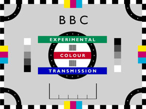
 Do you remember the early days of color television? Where only a handful of TV channels existed and programs were not running 24 hours a day and 7 days a week. Those days were the glory days of test patterns, also known as test cards.
The patterns were originally real cards used to calibrate the cameras. Soon they were replaced by patterns generated by test signal generators which could be used to adjust the equipment for optimal functionality.
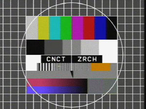 Seen through colorblind eyes a modern LCD computer monitor has a many times better color reproduction than any color television. When looking at these pictures this feeling gets supported very much. The colors feel dull and almost interfere with each other. There is not a clear and crisp vision of the colors at all. This observation raises the question to me: Does somebody affected by color blindness have an even worse color impression on a color television compared to normal vision?
I don’t know the answer. Maybe some of you made some similar observations and share this feeling.
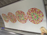
But let’s get back to the test patterns. If you look at the colors on the second and third image they are very badly chosen for somebody being red-green colorblind.
I will try to show you what I mean by listing my view of the colors starting at the left hand side:
- white or very light gray
- orange or light green
- light gray
- light green or orange
- pink close to blue
- red
- dark blue or purple
- black
The colors of the stripes 2 and 4 and of the stripes 5 and 7 are very close together for my eyes. These are very typical colors to be mixed up by protanope or deuteranope people. What perturbs me a bit is, that stripe number 6 is a clear red to me. No way this could be green even though I am red-green colorblind.
Further readings:
The Test Card Gallery
tv-testbild.com (German)
Wikipedia: Test Card
Related articles:
Green versus Orange
Colorful Ropes
Playing Trivial Pursuit with a Colorblind
Imagine the Green is Red
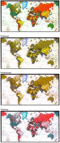
 Original Image
 Protanope Simulation
 Deuteranope Simulation
 Tritanope Simulation