Ever tried to make your own Ishihara plates test? Alon has the answer for all of us who are not that inventive or at least not good with computer programs.

Which number do you see?
Photo taken by Alon Salant.

Ever tried to make your own Ishihara plates test? Alon has the answer for all of us who are not that inventive or at least not good with computer programs.
Which number do you see?
Photo taken by Alon Salant.
The Fuck the Colorblind t-shirt seems to be very popular. A lot of people are looking for it and I received quite some comments on it. Some people like it, others not.
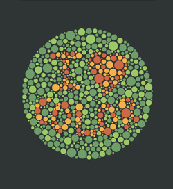
Here is the counterpart: I ♥ Color. Well, I know. It’s not really saying anything about colorblind people. But it is also made out of a pseudoisochromatic picture, also known as Ishihara plates. This texts or numbers usually are hidden if you suffer some type of color blindness.
Can you see it?
The shirt is available at Threadless T-Shirts. And there are some nice pictures of happy people wearing it.
Now it’s up. You can decide between Love the Colorblind and Fuck the Colorblind. Which message do you prefer to put on your chest?
I enjoy going to the zoo very much. And as we are a big family now we even have a season card for the local zoo.
Christopher wrote about Finding Color at the Zoo. So what does a colorblind guy do with his camera handy and looking for some nice shots to take? – He is also looking for colorful pictures; even if this sounds a bit contradicting.
Here is the most colorful picture I took at my last visit. It’s the very colorful eye on the tail of a peacock.
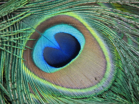
And here are the colors I can perceive through my colorblind eyes. Starting from the middle going outwards.
Now it would be interesting to know: How far away are my colors from to the reality? And what colors do you see?
At the moment the weather feels more like summer than anything else. But it’s still springtime which also means that all the blossoms shine in many different beautiful colors.
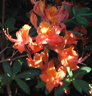
A few days ago I posted a picture about some red spring blossoms which beautify our garden. You want believe it, but just besides this bush where I didn’t recognize the shiny red blossoms, is another bush in the middle of its bloom carrying orange blossoms. And of course, you already will have guessed it, I didn’t see them till my wife told me about it.
The orange blossoms are even harder to see than the red ones. For my eyes orange looks almost the same as green. So it takes quite an effort to spot the difference. Due to my red-blindness (protanopia) an orange whatever will definitely never stand out in a green surrounding.
Yesterday my wife and I went past a plant in our garden. She told me about how she likes the red blossoms of it and only in this moment I realized, that this bush has blossoms at all.
Before yesterday I walked past a green bush day after day. Because of my color blindness (I’m very much red-blind) I never realized that during the last beautiful early summer days it had developed such nice blossoms.
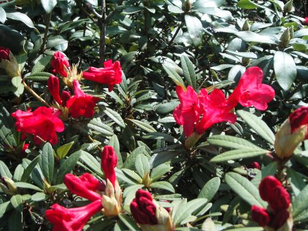
Now I know about the blossoms and therefore I can see them. But still, they don’t catch my eye and seeing them through my colorblind eyes they are very well hidden inside the green leaves.
For me this is a very typical example how a colorblind sees the world different than somebody with normal color vision. But do you really miss something if you just can’t see it?
A friend of mine stays at the moment in Perth, Western Australia, for his post doctoral studies. He maintains a little weblog about his impressions and some of the latest news from Downunder.
In a recent entry he reported from his trip to the Wildflower Festival. He was a little bit disappointed because there were not that many wildflowers as he thought of. But at least he did take some nice pictures of some of them which he posted on his blog.
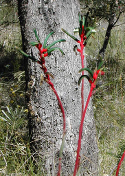
Have a look at this nice flower on the left side. This is the Red and Green Kangaroo Paw which is by the way the floral emblem of Western Australia. Some kind of a special flower but any way a nice one. To me there is only the question left: Where is the red part of the flower?
If you can see it — lucky you. To me it’s all the same color. Maybe this is another nice example of how the world sometimes looks like to somebody suffering from color blindness. Sometimes it is just a bit more greyish.
I felt relieved when I spotted this picture at Flickr. There are at least two colorblind persons on this planet: Ed and me.
 Some rights reserved
The picture was taken by jon|k out of a moving car. I suppose at least he is not colorblind.

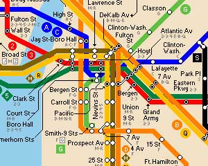
Subway Map Seoul
Seoul has quite a big subway system. On the left-hand side you can see a clipping of the whole plan. This small part already shows the problem which arises when colorblind people try to decipher subway maps: There are too few well distinguishable colors which can be used for coloring.
Subway Map Ney Nork
New York has the even larger subway system and therefore is a real challenge for the color department. Lines running parallel and crossing lines look often the same. This makes it hard to read. A good point: The line letters are spread over the whole map, so you can at least follow the letters.

Subway Map London
Actually it should be possible to choose different colors combined with patterns to make a subway map readable. The London tube map is not any better than the others. Sometimes similar lines are either form north to south or east to west, a slight improvement.
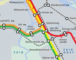
Subway Map Amsterdam
This is the very best I found. The Amsterdam subway map has only four different lines to distinguish. But still they weren’t able to choose the colors well enough. The green and orange (I hope they are green and orange) look almost the same to people affected by red-green color blindness!

Subway Map Tokyo
This map looks the most complicated. Too many lines intertwine into each other. Too many colors who should be distinguished and matched to a legend. But at least they realized the problem that such maps are not readable for colorblind passengers and put effort into improvements.
All maps were found through The Subway Page, which has an incredible list of links to subway maps from all around the world.
Related articles:
Japan’s Public Facilities Making Life Easier for Colorblind
Color Coded Power Types
Project Management by Red and Green Light
Yesterday early morning my wife said to me:
Have a look at this very nice sunrise. It’s in glowing orange colored shades – beautiful.
I took out our digital camera, took a photograph and here it is. It is nice but I don’t have a clue if it is orange or not. Have a look yourself.
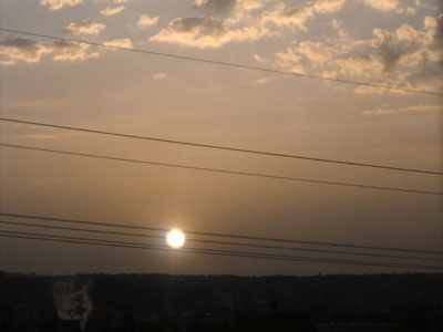
Funnily enough, Orange and Sunrise are two of the three major telecom companies in Switzerland.
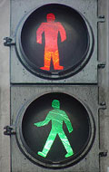
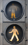
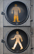
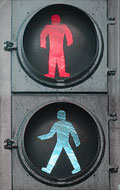
People affected by color blindness do see a difference between the little green man who is walking and the red man who waits to turn green. Maybe the difference is not the same difference as you can see it, but there is a difference.
For my colorblind eyes the first and the second pictures are similar and the third is almost the same again. Only the last one is definitely different. It looks more like a grayscale picture to me.
 |
 |
 |
 |
Photos taken by J. Ignacio Stark – Some rights reserved.
The photographs are shown in the following order: Normal – Protanopia – Deuteranopia – Tritanopia. Choose the one which is most suitable to you.
Related articles:
At the Traffic Light
5 Misbeliefs about Color Blindness
This will close in 0 seconds