Paul Wynne, an occasional colorblind underground user of the London subway, says
What is a straightforward glimpse at a map for most travellers there, is a nightmare of trying to separate similar colours for me,…
This topic is not new to colorblind people. Also in 2007 a group of Norwegian Students thought about Improving the Readability of Public Transport Maps for Colorblind Travelers. Subway Maps in general are definitely not an easy thing to decipher for peoply with any form of color vision deficiency.
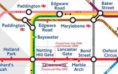
Because of that Paul decided to design a new kind of map, which enhances the color information of each subway line with an additional unique pattern. This way it should be possible for any type of colorblind person to read the map easily.

The combination of color and the idea of the scattered pattern supports the readability extremely. For me as a strongly red-blind person, it is much easier to spot the correct line and to find my way around the map. In opposite to most other pattern ideas, which highlight the pattern very prominently, this patterns are just a subtle support for the colors. And because of that, the pattern enhanced colored lines are not only easy to match but also don’t disturb the map as a whole.
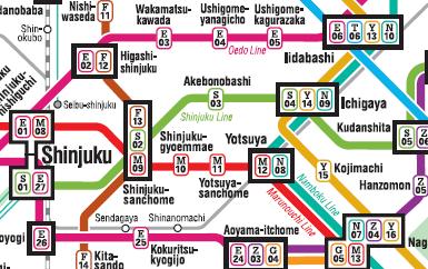
In 2006 there was also the decision by Japan’s Public Facilities Making Life Easier for Colorblind People. When we look at Tokyo’s subway map now, we can also see some improvement in the readability.

In this case the designers went along a different path. They decided to use letters to identify the different lines uniquely. A combination of the line letter and the station number enhances the readability and makes it much easier to find your way around the map. This is definitely an improvement to the old version. But on the other side I personally think that the letters are also a little bit confusing and the map gets to crowded with all the information.
What do you think about the different subway maps for colorblind people from London and Tokyo? Do you think this could be a possibilty to enhance any kind of colored maps? Which color, pattern combination do you think is the most effective one for colorblind users?
You can find the London map of Paul including some further information at: A Map of the London Underground for Colourblind People.

In the San Francisco Bay Area we have a traffic monitoring website, 511.org, that actually considered the colorblind in it’s design. Traffic congestion is normally displayed with red, yellow and green (heavy, moderate or clear respectively).
How they help us colorblind folks is with a drop down tab on the map that can change the colors of the map depending on which type of color deficiency one has, it’s an extremely useful tool that I commend them on their foresight.
Matt, thanks a lot for sharing the link 511.org with us. I just checked their site and trafic map.
In red-green colorblind mode I definitely could spot the different colors much better. I even suggested to use some form of color/pattern mixture – which I believe is the best choice.
Thanks – Daniel from Colblindo