Category Archives: Tools

Color Translation — Readable Diagrams for the Colorblind

It can be really annoying if you find some descriptive graphics or a nice diagram and you can’t decipher it because it is color coded. Even if you are suffering from red-green color blindness — which is the most common form of color vision deficiencies — you aren’t spared to come across such diagrams.

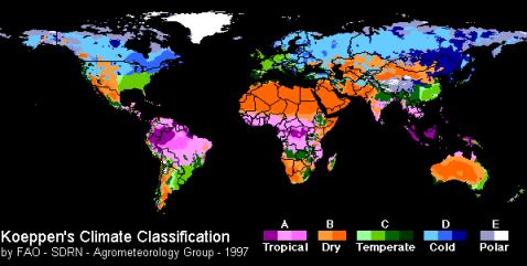
Have a look at the following diagram of the climate classification. If you are red-green colorblind it can be a big problem to distinguish Tropical from Cold and also Dry from Temperate zones. In the first case it doesn’t really matter because the different zones are far apart form each other. The latter case is worse.

Climate Classification

In such cases Protanope Tools comes in very handy. With this little online tool you can change the color spectrum and make those undistinguishable parts of color coded diagrams visible. Protanope Tools is made for red-green colorblind persons and offers two different possibilities:

  1. Shift from red-green to blue-yellow.
  2. Shift from red-green to green-magenta.

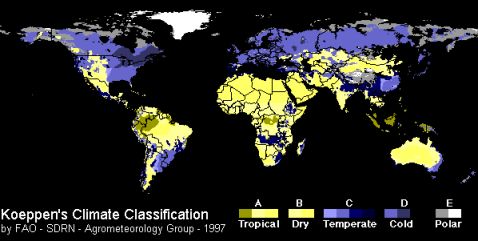
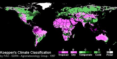
Have a look at the following two diagrams which were created with Protanope Tools based on the above image. The colors change dramatically. In both cases the climate zones Dry and Temperate are clearly distinguishable. Even though Cold looks almost the same as Temperate and also Tropical and Dry look almost the same if you suffer from a strong red-green color blindness.

Climate Classification - Blue Yellow
Climate Classification – Blue Yellow
Climate Classification - Magenta Green
Climate Classification – Magenta Green

Protanope Tools offers the possibility to color translate any image. You can just drag the two bookmarklets below to your browser bookmarks and this way you always have the two direct color translations ready whenever you come across a colorful diagram.

The best case when you colorize your own diagrams is and will always be the one, where nobody needs a separate tool to understand your message. Be aware of color blindness when you color code your own graphics and for every other case Protanope Tools will help you out.

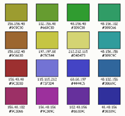
Update: To get a better understanding of what goes on behind the scenes of these color translations, read the article on Simple Color Translation Algorithms, which reveals the two algorithms used above.

Color Schemes Generator 2

Web designers often have a very good feeling for colors and don’t need a tool which supports choosing good color combinations. Color Schemes Generator 2 goes one step further and not only generates nice color schemes but also offers the possibilty to view the generated schemes as colorblind people may see them.

Color Scheme Generator - Color Wheel
Color Wheel

The color schemes are generated from a base color, which has to be set on the color wheel, and a chosen scheme. Five different schemes are offered to choose from:

  • Mono, based on one color tint,
  • Contrast, adding the complement,
  • Triad, with two additional colors,
  • Tetrad, based on four colors and
  • Analogic, with two adjacent colors.

The angle/distance for the Triad, Tetrad and Analogic color schemes can be individually adjusted with the help of a small slider.

On a first glance the tool looks simple and easy but this main functionality is only the tip of the iceberg. You can use RGB values, circle through different saturations, adjust each color individually, reduce a scheme to web colors, choose between six different variations and even save a direct link to the generated scheme.

Color Scheme Generator - Color Scheme
Generated Color Scheme

To me the feature of Color Schemes Generator 2 which sticks out most is the possibility of viewing a color scheme as a colorblind sees it. You can select one out of nine different types to adjust the view on the scheme: Normal Vision, Protanopy, Deuteranopy, Tritanopy, Protanomly, Deuteranomaly, Tritanomaly, Full Colorblindness and Atypical Achromatism.

If you are colorblind this is not so much of help.

For all others it gives some impressions about how colors are experienced by colorblind people. This helps a lot in choosing good color schemes and by good I mean schemes which can be seen and distinguished by colorblind people as well. One step forward towards better web accessibility.

But apart from all the good there is also a downside:

All the different possibilities of adjustments make it almost impossible to find a good color combination. If you are colorblind you have to rely on tools and you can not rely on your eyes. Too many buttons and sliders are distracting and don’t support the goal to generate a great color scheme automatically.

By the way this nice tool can even be used offline. It is based on CSS/Javascript and a downloadable zip-file is offered for easy installation.

Related articles:
Web Site Accessibility
Choosing the Right Colors
Simulating Color Blind Vision

Direct link to Color Schemes Generator 2.

Color Oracle

Color Oracle
Color Oracle

Color Oracle is a full screen color filter released by Bernhard Jenny of the Institute of Cartography, ETH Zurich. Because the swiss federal institute of technology (ETH) is just around the corner of where I am living I proudly pass on some notes about this new tool.

As the tool is Mac only I couldn’t have a closer look at it because I am “PC only”. But the homepage gives some clues about the features of Color Oracle which are listed below.

  • Simulation of deuteranopia, protanopia and tritanopia
  • Dragable and resizeable information panel
  • System-wide menu and keyboard shortcuts
  • Saving of filtered screen images

As mentioned above if Color Oracle is turned on the actual full screen is appropriately simulated independently of the software you are using for designing your art.

And if you are not a proud owner of a Macintosh the team of Color Oracle provides some further links about similar tools and online possibilities for simulating colorblind vision.

Related articles:
Colour Contrast Analyser
Simulating Color Blind Vision
Colorblind Web Page Filter

Colour Contrast Analyser

The Web Accessibility Tools Consortium (WAT-C), a collaboration of some of the world’s leading accessibility practitioners, released just before Easter version 1.1 of the Colour Contrast Analyser.

Its main purpose is to check foreground and background color combinations on the Luminosity Contrast Ratio and the Color Difference and Brightness Difference algorithms, suggested by the World Wide Web Consortium (W3C), to verify if the combinations provide good color visibility.

Colour Contrast Analyser
Colour Contrast Analyser – Results

On top of that the tool offers additional information concerning the different kinds of color vision deficiencies. The ratio, color and brightness differences are also calculated for protan, deutan and tritan color blindness. Therefore you can check if your color combinations are not only good enough for normal vision but also if they are readable by people suffering from one of the most common types of color blindness.

The Colour Contrast Analyser gives also a very nice overall impression and I would like to point out some of its features.

  • If desired the tool can be shown on top of all your windows for a better handling.
  • A color picker is offered for choosing foreground and background colors.
  • The Colour Select reflects directly the chosen color (through color picker).
  • Support for Hex and RGB color values.
  • Slider controls for Red, Green and Blue values.

But not enough.

There is also the Select window (List) where you can choose one of your active screens and transform it, taking into account one of the following options: Protanopia, Deuteranopia, Tritanopia, Grayscale, Invert or Cataracts. The same is possible trough Select image file where the resource is either a JPG or a BMP image file.

And the cherry on the cake: Colour Contrast Analyser offers a Simulation Viewer to transform a specific screen area on the fly. The options you can choose from are similar to the ones in the Select window (list) and Select image file tools.

To subsume it in a nutshell:

  • Luminosity Contrast Ratio, Color Difference and Brightness Difference algorithms
  • Results for Normal vision, Protanopia, Deuteranopia and Tritanopia
  • Select window (List) and Select image file for direct transformations
  • Simulation Viewer for on screen conversions
  • Simulation options:
    • Protanopia
    • Deuteranopia
    • Tritanopia
    • Grayscale
    • Invert
    • Cataracts

I am very taken with the Colour Contrast Analyser and my suggestion is: Go ahead, download it and give it at try. All information and a downloadable zip-file (unfortunately Windows only) can be found at Colour Contrast Analyser 1.1. The tool is licenced under a Creative Commons Licence.

Further readings:
New Colour Contrast Analyser 1.1 now available
Vision Australia: Colour Contrast Analyser
Luminosity Contrast Ratio
Color Difference and Brightness Difference

Related articles:
Colorblind Web Page Filter
Web Site Accessibility
Battle Against Color Blindness With EyePilot

Colorblind Web Page Filter

The Colorblind Web Page Filter is a great web application to get an impression how a web page is viewed by people affected by any kind of color blindness. After indicating the URL and choosing the appropriate color filter the view is directly shown inside the browser window.

Colorblind Web Page Filter
Filters and Settings Box

In addition to the web page a settings box is shown on top of the page. This box offers all the different color filters and does switch the view after choosing a new filter. As well some settings concerning scripts, images and CSS can directly be adjusted. Turning off images makes the transformation process remarkably faster. But this usually isn’t appropriate because images are an important design element in web pages which shouldn’t be underestimated.

To get an impression what it looks like try one of these direct links:

Maybe you should check your own web page or blog to find some potentially blind spots. Remember, there are between 8% and 12% of men affected by some kind of color blindness. If you count on visitors, count on the colorblinds too.

Related articles:
Choosing the Right Colors
Battle Against Color Blindness With EyePilot
Imagine the Green is Red
Japan’s Public Facilities Making Life Easier for Colorblind

Direct link to Colorblind Web Page Filter.

ColorBrewer

If you have to color a map and are not sure which color palette you should use maybe ColorBrewer comes to your help. This little online tool shows how a color scheme looks in a map and helps you deciding on the right colors which accomplish your needs.

There is a sample map shown and you are guided through three simple steps for coloring the map:

  • Step 1: Select the count of needed color classes.
  • Step 2: Choose the legend type, either sequential for ordered data from low to high, or diverging which emphasis mid-range critical values or as a last option qualitative with no direct relation between the different color classes.
  • Step 3: After Step 2 different color sets are shown. Choose one and the sample map is getting colored with the appropriate color legend.

The interesting part starts after those 3 steps. If a color scheme is chosen the CMYK, RGB, HEX, LAB or ArcView 3.x (GIS format) values can be accessed. That’s great. On top of that additional information is shown if the chosen scheme is suitable for photocopying, LCD projector, laptop screen, CRT screen, color printing or if it will not confuse people suffering from red-green color blindness.

I tried it out and browsed through many color schemes. Most often it showed that the chosen scheme is ok for colorblind people. But when I had a close look at the colors I could definitely tell that I will have some problems with this color scheme. I don’t know where from they got the information if one scheme is confusing and others are not, but they definitely should have taken a bigger test bed or better algorithms.

Maybe they belief that if red and green are not mixed into one color scheme it is not a problem regarding red-green color blindness. This is a misbelief. The tool is ok and can maybe help you out on chosing the right colors. But please don’t trust them regarding the suggestions about color blindness. They are wrong and give a faulty feeling of certainty.

Related articles:
Choosing the Right Colors
Simulating Colorblind Vision
How the World is seen through Colorblind Eyes

RGB is not Hue-Saturation-Value

In a recent article I had a closer look at eyePilot. In my tests two bugs showed up which I reported to the producers of eyePilot.

The more severe bug where they show some wrong RGB values is based on some simple circumstances. This doesn’t excuse the factor that the bug crept into released software. But read yourself the answer from Dennis Purcell, Senior Scientist at Tenebraex Corporation:

Dear Mr Flueck,

You are absolutely right — the rgb values are not correct. In fact, they are the hue-saturation-value numbers that we used for developing the color assignments. At one time they were part of the readout, until we figured that most people would be satisfied with rgb — the right rgb, that is! And it certainly was careless not to have checked those numbers before release. […]

thanks and best wishes,

Dennis Purcell
Senior Scientist
Tenebraex Corporation

So dear programmers living out there. Please test your software, test it twice and let it be tested by others before release date. We don’t want to be beta-testers. That is something we already know from the products released by a company called Microsoft…

Further reading:
eyePilot
New Software Tackles Colorblind Challenges

Related articles:
Battle Agains Color Blindness With EyePilot
Microsoft knows about Color Blindness

Battle Against Color Blindness With EyePilot

Almost two weeks ago the news New Software Tackles Colorblind Challenges announced the launch of eyePilot. This little helper is introduced by Tenebraex, a company primarily specialized on tools based on optical technologies.

You can get a 30 days trial to see how it operates and that’s what I did. As a first impression I see a nice little tool with no extras which you anyway never get to use. A very slim interface just showing what you need: a dropdown where you can choose one of four different functionalities (Gray, Flash, Name, Hue) and a few buttons according to the chosen functionality. That is it, very nice. Let’s try one by one.

Gray. Through this option you can color everything gray inside the eyePilot window, except the color you clicked on. There is the possibility to widen or narrow the color range according to your needs. As well you can choose if it should be a light-, mid- or dark-gray. The option Gray is a great helper if you have to find same colors which are spread over a picture or diagram. If there are many colors involved this task is almost impossible to complete for somebody who is colorblind. At How the World is seen trough Colorblind Eyes I already tried to show the difficulties for somebody who is suffering from color blindness with this rather beautiful colored map of the earth.

Name. With the funcionality Name the colors you pick get labeled. I described in The Color of Crayons how it is not always easy to pick the correct crayon if you are suffering from color blindness. As the example picture shows, the chosen crayon is red. I definitely would have said this is brown. Would be great if I could use this tool not only on a computer but also in everyday life.

Flash. This is the opposite of Gray. As long as you click and hold the color underneath the cursor is painted black on the whole picture. A very helpful tool on diagrams including a legend: just click on the color showed in the legend and it is highlighted inside the whole diagram.

Hue. This is the last option and helps you find the best contrasts in a picture. I found a great little example on the web. In the shown photography of the Orion Nebula you can see on the lower part the original and on the upper part the modified picture. Without Hue I couldn’t tell if there exists a nebula at all. Only when circulating through the different hues I can spot it.

As a conclusion I would say this is a neat little tool and can be of great help for people suffering from any kind of color blindness and even people with normal vision. Complex diagrams are even for those (out there) not always easy to read.

While testing I found two bugs which makes eyePilot look kind of unprofessional. If you’ve chosen the option Name and want to change again, the tooltip text and the dropdown box compete against each other. It works but it is a bit nasty.

The second bug is much more severe. If the name of a color is shown the RGB values are written into the tooltiptext as well. You can see it at the example picture above. But the values are wrong. Not only that they are in an incorrect order but also the values are completely wrong. I tested it against photoshop with different colors. This bug really irritates and makes me feel that this tool was definitely not enough tested before release date – too bad.

Further readings:
New Software Tackles Colorblind Challenges
eyePilot

Related articles:
How the World is seen trough Colorblind Eyes
The Color of Crayons

Choosing the Right Colors

If you have a color deficiency and want to design a webpage you either are very self-confident or looking around for some help. Of course other persons can be very helpful but they are never around the time you need them and tend to have so many different opinions. Why not stick to bits and bytes?

Color Scheme
Example color scheme

For example Color Schemer is among others a good tool for choosing matching colors. There is an online section where you can compute matching colors based on a given one. They even offer a free download called ColorPix which can be used to find your base color say on a given picture or webpage you like.

It was a great help for me when I played around with webpages and image editing tools. Of course I could choose just any colors I like and who match for my eyes. But every time I showed them to persons with no color deficiency they cried aloud. The outcomes where just not made for normal vision maybe winning at most some bad taste award. That was the time when I started using those supporting tools for color picking. And now I can be happy with the results and they don’t put others to rout anymore – at least when it comes to colors.

Simulating Color Blind Vision

Do you want to simulate a color blind vision? Go to Vischeck and try it online. You can find out what an image or a webpage looks like if you suffer from Deuteranope, Protanope or Tritanope. I think this tool is just great and for me I often can’t see any difference between the original image or the simulated images neither for Deuteranope nor for Protanope. On their webpage you can even find a PhotoShop plugin to download for free. The plugin offers the same image corrections as described above.

A second but for us color blind people even more interesting tool is the online Daltonize of images. Daltonize tries to correct images for color blind people. You can adjust a red/green stretch factor (Deuteranope and Protanope), a luminance correction and a blue/yellow correction (Tritanope). Give it a try and see what you maybe can’t see yet.