If you are interested in web design and wonder how you can design a web site taking into account that one out of twelve persons is colorblind, you have to read this well researched article.
Rachel starts with a short and comprehensive overview on color blindness and heads afterwards into some details about how to design web sites for colorblind users. On top of that she ends with a large link list pointing to other sources on the topic and tools for web site designers. — Well done.
Update: It looks like the site went inactive just this weekend! I only realised after writing this article, that the weblog wasn’t updated for quite a long time. At the moment the article is still available through Google cache here.
If you are suffering from red-green color blindness, what are the chances that your neighbour or one of your classmates also suffers from it? What we like are numbers and one of the most often asked and searched for questions about color vision deficiencies is: How many people are affected by color blindness?
Before we digg right into some interesting numbers about red-green color blindness you should be aware of the following facts:
Tritanopia (blue-yellow color blindness) is rare. Some sources estimate that 0.008% are affected by this type of color vision deficiency.
Monochromacy (complete color blindness) is very rare. Different sources vary between 1 in 33’000 to 100’000 (0.001%).
Families are not a good source of numbers concerning color blindness, because vision deficiencies are inherited and therefore some families are affected much more than others.
Red-green color blindness is the most common color vision deficiency; therefore most of the researches found regard this type of colorblind population. The following figures are listed in the book Color Vision: From genes to perception and combine many different surveys spread over the last century.
Gender
Anomaly
Anopia
Protan
Deutan
Protan
Deutan
Male
1.08%
4.63%
1.01%
1.27%
Female
0.03%
0.36%
0.02%
0.01%
Ratios of red-green color blindness types
Four different deficiencies make up the common wording red-green color blindness. People suffering from an anomaly are trichromats but do report problems in color perception in the green-yellow-red sector of the spectrum. The two different types show a less sensitiveness either to red light (Protan) or green light (Deutan). In opposite people suffering from an anopia are dichromats, completely lacking one type of retinal cones.
The figures above basically show the following important facts about red-green color blindness:
Roughly 8% of men and 0.5% of women are affected. Therefore chances that your neighbour or one of your classmates is colorblind are very high.
Deutanomaly is by far the most common color vision deficiency regarding red-green color blindness. The other three types are occurring at nearly the same ratio and do affect about one out of 100 persons each.
Men are approximately 100 times more often affected than women. This shows very nicely that red-green color blindness is a sex-linked trait as described in more detail at The Biology behind Red-Green Color Blindness.
A last note about the figures: If you always thought that you are someone special because of your color blindness, you might be wrong. Especially if you are male and suffering from Deuteranonmaly one could say you are one under many and you can meet fellow sufferers out on the street every day.
According to recent studies at the Universities of California and Chicago, language affects half of what we see. The researches base on the well known Sapir-Whorf hypothesis which states, that there is a relationship between our language and our experiences and thoughts.
The Sapir-Whorf hypothesis can be tracked back to the late 19th century and started a long and lasting debate about language-and-thought. This new results provide an unexpected resolution to the debate.
Circle of Color Squares
The studies are primaraly based on the following experiment: A circle of 12 squares is shown to the participants. All but one square have the same color, some shade of green. The odd square was either painted in another shade of green or in some shade of blue.
Before we have a look at the results let me point out two important things: First of all language function is processed predominantly in the left hemisphere of the brain. And secondly visual impressions from the right side are mostly handled on the lefthand side of the brain and vice versa.
The results of the experiment were as follows: If the odd square was on the right half of the visual field the participants reacted faster if the color had a different name (blue) than if it had the same color name (green). But notice this happened only on the right part of the visual field. The scientists say the reason to this is because language is also processed on the left side. Whenever the odd square was on the left half of the visual field no such factor could be measured.
Due to those experiment they concluded, that language affects vision, but only if it is processed on the same side as language function. Vision is therefore at the same time filtered and not filtered through language.
And what happens if we get on top of that color blindness into the game? People suffering from color blindness share the same language but have a different visual impression. Would they perform worse, better or just the same as people with no color vision deficiency?
Of course, if you can’t see the different shades it is not worth making the test. But if you can view them but can’t exactly tell, which is a shade of blue and which a shade of green. It would be very interesting to now the answer. Unfortunately they don’t make any statements about color blindness.
What do you think? Does language affect color vision when suffering from color blindness in the same way?
Do you like sunsets? When the sky gets covored with all those beautiful colors, the sun shines in all kind of shades, the mountains are glowing and everybody says: Wow, look. It’s so beautiful.
I always look and say: What? What is so beautiful?
From our house we can see the mountains. And often my wife tries to describe me when the sun sets how they are glowing in different shades, reflecting the sunrays. But I never ever can see nothing.
Of course I can see the mountains, but most of the time they are just gray. All different shades of gray, but still only gray and nothing else.
Do you like sunsets as well? I prefer it when the sun is gone and the moon and stars are shining. Because after the sun went down everybody sees the same – all the colors are gone.
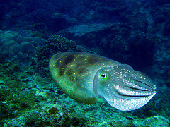
Cuttlefish have three hearts which pump blood with shades of green and blue through their veins. Cuttlefish have ink and they are caught for food. But the most fascinating fact is: Cuttlefish can rapidly change their skin color. Among others this is used to camouflage them from predators. They adjust their skin color to the ground below them even though they are colorblind!
The next logical step for scientists now is to solve the puzzle how these creatures are nevertheless so good at comouflage themselves.
To find out more about the color blindness of cuttlefish the team around Lydia M. Mäthger used two different types of checkerboards to test their color vision in combination with a change of their body pattern.
Gray – Green. One green shade, matched to the maximum absorption wavelength of cuttlefish, was combined with 16 different shades of gray. As supposed some shades of gray couldn’t be distinguished from the green by the cuttlefish, which didn’t adapt the body pattern. Experiment one was successful.
Blue – Yellow. A checkerboard of blue and yellow matching in intensity was used for the second experiment. The skin color of the test species didn’t change either and therefore experiment two was also successful.
Even though cuttlefish have one of the most developed vision system and can even perceive the polarity of light, this experiments show that they are definitely suffering from color blindness.
The research paper closes with the following words about colorblind camouflage.
In shallow depths of water, broad-spectrum sunlight is available and consequently colored object in the natural environment will appear colorful. At greater depths, the composition of daylight becomes increasingly restricted to the bluegreen parts of the spectrum and the environment loses its colorful appearance. In this light environment, camouflage by intensity matching may be highly effective. Certainly, cuttlefish have broadband light reflectors that reflect the ambient wavelengths of light and may thus aid intensity matching at least at a localized level. However, the vexing question of how cuttlefish masters the task of camouflage in chromatically rich environments, such as those found at shallow depths of water, remains to be answered.
It is interesting to read what other people tell about their color blindness or color vision. Sometimes there even pop up some funny questions related to color blindness. I would like to post a little excerpt over the last few days and hope you enjoy.
Jac tries to explain at Ooh! Look at the pretty music! how life with Synaesthesia looks like. With Synaesthesia for example the hearing of a sound can produce some visualisation of colors.
In Do you see what I see? g8s tells his story of color blindness, including a white ‘go’ traffic light and how life would be working as a color printer.
Jes asks Does anyone know if cows are colorblind? Unfortunately the site appears in such a badly chosen color scheme that if cows would be colorblind, they couldn’t give her an answer.
Chris observes the Benefits of Wine where the question arises, if drinking wine is a major cause of color blindness.
Pete describes in his recent article Colourblind his confusion about color vision. What I like best is the nice colors he choosed to reflect the confusion.
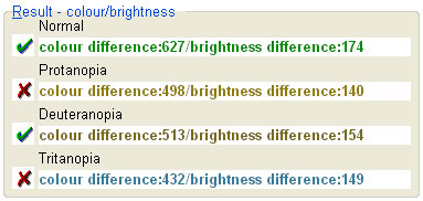
On top of that the tool offers additional information concerning the different kinds of color vision deficiencies. The ratio, color and brightness differences are also calculated for protan, deutan and tritan color blindness. Therefore you can check if your color combinations are not only good enough for normal vision but also if they are readable by people suffering from one of the most common types of color blindness.
The Colour Contrast Analyser gives also a very nice overall impression and I would like to point out some of its features.
If desired the tool can be shown on top of all your windows for a better handling.
A color picker is offered for choosing foreground and background colors.
The Colour Select reflects directly the chosen color (through color picker).
Support for Hex and RGB color values.
Slider controls for Red, Green and Blue values.
But not enough.
There is also the Select window (List) where you can choose one of your active screens and transform it, taking into account one of the following options: Protanopia, Deuteranopia, Tritanopia, Grayscale, Invert or Cataracts. The same is possible trough Select image file where the resource is either a JPG or a BMP image file.
And the cherry on the cake: Colour Contrast Analyser offers a Simulation Viewer to transform a specific screen area on the fly. The options you can choose from are similar to the ones in the Select window (list) and Select image file tools.
To subsume it in a nutshell:
Luminosity Contrast Ratio, Color Difference and Brightness Difference algorithms
Results for Normal vision, Protanopia, Deuteranopia and Tritanopia
Select window (List) and Select image file for direct transformations
Simulation Viewer for on screen conversions
Simulation options:
Protanopia
Deuteranopia
Tritanopia
Grayscale
Invert
Cataracts
I am very taken with the Colour Contrast Analyser and my suggestion is: Go ahead, download it and give it at try. All information and a downloadable zip-file (unfortunately Windows only) can be found at Colour Contrast Analyser 1.1. The tool is licenced under a Creative Commons Licence.
Miller is a painter and studying arts at the Wabash College in Crawfordsville, Indiana. And he is not just a painter but a colorblind painter.
It needs quite a bit of courage for such a decision. As a colorblind you know that you will never ever see the colors the same way as others do. There are no studies where you can learn it, nobody who can ever teach you. You will have to stick to it for the whole lifetime, knowing that you are always a colorblind painter and not just a painter.
“I have a more unbiased approach when I come into (painting). I don’t have the idea in my head of what would work with this, what would not. It gives me the option to experiment more.”
Through this a colorblind painter is not distracted by good matching colors or complementary colors. As Miller says, he can put more an eye on the action that’s created with different color combinations.
Or in other words: Don’t get distracted by your color blindness but try to turn it into an advantage.
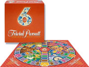
Playing board-games is great fun and a lovely pastime. One of the most famous among them is Trivial Pursuit. Chris Haney and Scott Abbott invented it in 1979. Trivial Pursuit was finally launched in 1981 and started its triumphal procession all around the world. It is now sold in at least 19 different languages spread over 33 countries.
Trivial Pursuit – Volume 6
It is a great game and I do love playing it. Everybody is eager to answer the imaginative questions and to collect the sought-after plastic pie slices. Everybody has his favourite area of questions and therefore his favourite color, as every of the six question areas is expressed through a distinct color. But the inventors made one big mistake which they never really eliminated.
Have you ever played Trivial Pursuit with a colorblind? It is still fun but sometimes it degenerates to a color guessing and asking game. The six different colors used to reflect the six different question areas are definitely not well chosen for people affected by a color vision deficiency.
Imagine the following two different situations are reoccurring all the time during the game.
Colorblind: “Ok. I landed on green. I love green question.” Not-Colorblind: “Wrong. You are on brown.” Colorblind: “Oh no. Come on, this is green.” Not-Colorblind: “No, definitely not.” Colorblind: “Ok. Let me move again. I hate brown questions.” Not-Colorblind: “Ok. Last time.” Colorblind: “Thanks.” (Move) “Now, ask me the green question.” Not-Colorblind: “Ohm, sorry. But this time you landed on orange…”
This was the first situation which happens all the time to me. I’m constantly asking if I got the colors right or if I mixed them up again.
In second situation the roles are swaped. But it is therefore not less common than the one described above.
Colorblind: “And the blue question for you is: …” Not-Colorblind: “Stop, stop. It is not blue. It is pink.” Colorblind: “Yes? Oh yes. I want to kid me again.” Not-Colorblind: “No. Honestly, it is pink and not blue.” Colorblind: “But last time you told me differently.” Not-Colorblind: “Who is having problems with colors here?” Colorblind: “Ok, ok. Next time I’m going to mark every single field…”
As I said, I really like this game very much and we quite often play it. But I would like it even more if they had chosen better colors or some kind of patterns which can be easily told apart from each other.
There are many different editions of Trivial Pursuit. Maybe there is even one where they have chosen another color strategy. Did you ever play such a colorblind-sensitive one?