Summer of Green

As I am a mostly green guy (we have no car, I love trains and I sometimes even ride my bike to work :-) I love to share this link to a new summer service of Google:

Maybe you like it and spot some good tips for your upcoming summer holidays. As I am living in Switzerland I have to wait until they include some cities from over here.

Color Schemes Generator 2

Web designers often have a very good feeling for colors and don’t need a tool which supports choosing good color combinations. Color Schemes Generator 2 goes one step further and not only generates nice color schemes but also offers the possibilty to view the generated schemes as colorblind people may see them.

Color Scheme Generator - Color Wheel
Color Wheel

The color schemes are generated from a base color, which has to be set on the color wheel, and a chosen scheme. Five different schemes are offered to choose from:

  • Mono, based on one color tint,
  • Contrast, adding the complement,
  • Triad, with two additional colors,
  • Tetrad, based on four colors and
  • Analogic, with two adjacent colors.

The angle/distance for the Triad, Tetrad and Analogic color schemes can be individually adjusted with the help of a small slider.

On a first glance the tool looks simple and easy but this main functionality is only the tip of the iceberg. You can use RGB values, circle through different saturations, adjust each color individually, reduce a scheme to web colors, choose between six different variations and even save a direct link to the generated scheme.

Color Scheme Generator - Color Scheme
Generated Color Scheme

To me the feature of Color Schemes Generator 2 which sticks out most is the possibility of viewing a color scheme as a colorblind sees it. You can select one out of nine different types to adjust the view on the scheme: Normal Vision, Protanopy, Deuteranopy, Tritanopy, Protanomly, Deuteranomaly, Tritanomaly, Full Colorblindness and Atypical Achromatism.

If you are colorblind this is not so much of help.

For all others it gives some impressions about how colors are experienced by colorblind people. This helps a lot in choosing good color schemes and by good I mean schemes which can be seen and distinguished by colorblind people as well. One step forward towards better web accessibility.

But apart from all the good there is also a downside:

All the different possibilities of adjustments make it almost impossible to find a good color combination. If you are colorblind you have to rely on tools and you can not rely on your eyes. Too many buttons and sliders are distracting and don’t support the goal to generate a great color scheme automatically.

By the way this nice tool can even be used offline. It is based on CSS/Javascript and a downloadable zip-file is offered for easy installation.

Related articles:
Web Site Accessibility
Choosing the Right Colors
Simulating Color Blind Vision

Direct link to Color Schemes Generator 2.

Color Perception in our Solar System

You can read some thoughts from Tom Coates at On the perception of the colours of Mars… He put a nice littel theory into the room and received quite some comments and a nice discussion around the topic.

The core of his theory goes like this:

…if we had evolved on Pluto, Jupiter or Venus, we’d perceive different wavelengths in more depth and with more variety. In fact, potentially if we’d been born on Mars, it would look to our eyes like a vibrant and colourful place, while Earth could look comparatively drab.

Reading through the comments you can learn a lot about color perception in our solar system. And also the posted links reveal a lot about the topic and let you dive even deeper into it.

And what about us colorblind?

Were we just born on the wrong planet? Maybe we would be the big guys with great vision on some other planet. For each kind of different color blindness there is out there somwhere a planet waiting. And because we are not yet ready to colonize other planets we (the colorblinds) are maybe just ahead of our time.

This is another clue to me that we colorblind people are one step ahead compared to our opponents, the not colorblinds ;-)

Related articles:
How the World is seen through Colorblind Eyes
Colorblind Peopla are Wise
Colorblind People are Dumb

Thanks to Helena from Bitter Poison for telling me about this article.

The One-Eyed Colorblind

Last Thursday we packed up our sleeping bags, a tent, cooking gear and catched a train southwards. In the southern part of Switzerland called Ticino we put up our tent for some lovely days in the sun. The weather forecast said: rain and cold temperatures north of the Alps and a lot of sun with warm temperatures in the south, the sun parlor of Switzerland – Ticino.

As we could enjoy an extra long weekend everything looked perfect. Apart that many other people had the same plan, it was just a great welcome for the upcoming summertime. At least the first 24 hours.

It was the first camping trip for our little Benjamin. He is only ten month old and needed some time to get himself used to the tent, his little sleeping bag and the whole surrounding. But I would say after a while he enjoyed himself very much. And of course we enjoyed it a lot too.

In the afternoon of our second day we planed some swimming lessons with our son. I hopped into the water and my wife handed our son over to me. In this very moment little Benjamin aimed and stroke directly into my right eye with his little finger.

For a moment I couldn’t open my eye anymore. I even lost my equilibrium sense for some seconds. It took a while until I was ready again for the swimming lesson.

The hours after the impact felt ok. I could do some stuff, we went shopping and even had a nice dinner in a lovely grotto. But my eye started to hurt more and more. I thought it will be over the next day after a good sleep, while my eye could relax. But it was even worse.

I couldn’t open my eye anymore easily. It was swollen and it needed quite some effort to use it. We decided to pack up our stuff and see somebody at the pharmacy in the next town. A nice woman had a close look at my red eye, I mean right eye :-) and said we have to go and see a doctor at the hospital.

Ok. Next step was the visit at the hospital. We were already feeling a bit uncomfortable about my eye. What was going on? But a very friendly doctor relieved from our thoughts. It was just a little cut in the cornea. He said this will be over in two days. I only have to cover the eye to relax it and to support the healing process.

So I was walking around like a pirat for the last two days. It not only did look very funny but it was also quite an experience. Just being able to see through one eye not only for a moment but for a whole day was a completely new feeling.

  • I couldn’t estimate distances. I had to feel the glass to be sure that I pour into it and not aside.
  • I couldn’t see to the sides. Because my left I was so focused on a spot I missed many things on the sides.
  • I couldn’t see on the right side. Of course I couldn’t see anything on the right eye because it was covered. This was a very strange feeling.
  • I felt exhausted. I don’t know if this was because I could only use one eye to see which exhausted me very much or if it was because of the healing process. But I had to take a nap several times a day to have at least some power for the rest of the day.

I am happy that this is over now and I can see again through both eyes. My right eye is not hurting anymore and the vision is almost back as it was before. Supposably it will heal completely during the next couple of days and I will be back again colorblind but sighted.

This last days showed me that color blindness is a handicap but just a tiny little one compared to half or even complete blindness. Always think of that when you feel disadvantaged through your color blindness.

Related articles:
Shopping for my Boy
Supporting a Colorblind Husband

Subway Maps

Subway Map Seoul - Part
Subway Map Seoul
Seoul has quite a big subway system. On the left-hand side you can see a clipping of the whole plan. This small part already shows the problem which arises when colorblind people try to decipher subway maps: There are too few well distinguishable colors which can be used for coloring.

Subway Map New York - Part
Subway Map Ney Nork
New York has the even larger subway system and therefore is a real challenge for the color department. Lines running parallel and crossing lines look often the same. This makes it hard to read. A good point: The line letters are spread over the whole map, so you can at least follow the letters.

Subway Map London - Part
Subway Map London
Actually it should be possible to choose different colors combined with patterns to make a subway map readable. The London tube map is not any better than the others. Sometimes similar lines are either form north to south or east to west, a slight improvement.

Subway Map Amsterdam - Part
Subway Map Amsterdam
This is the very best I found. The Amsterdam subway map has only four different lines to distinguish. But still they weren’t able to choose the colors well enough. The green and orange (I hope they are green and orange) look almost the same to people affected by red-green color blindness!

Subway Map Tokyo - Part
Subway Map Tokyo
This map looks the most complicated. Too many lines intertwine into each other. Too many colors who should be distinguished and matched to a legend. But at least they realized the problem that such maps are not readable for colorblind passengers and put effort into improvements.


All maps were found through The Subway Page, which has an incredible list of links to subway maps from all around the world.

Related articles:
Japan’s Public Facilities Making Life Easier for Colorblind
Color Coded Power Types
Project Management by Red and Green Light

Effective Presentations with Laser Pointers

Laser pointers are often used in presentations to show the hot spots or a part of the slide which the presenter is talking about. Most often people don’t know about the drawbacks concerning colorblind members of the audience when using laser pointers.

If you are not affected by color blindness the little red or green spot which is produced by a laser pointer can not be overseen. The little dot is so bright, shiny and clear that your eye easily finds it. Even following the light if it is moved quite fast isn’t a problem at all.

Now if we look at it through colorblind eyes this looks totaly different. Maybe this affects only people with red-green color blindness because of the color used in laser pointers. The laser pointer spot just isn’t that much outshining to colorblind people as it should be. Therefore it is very hard to follow the point – or often it can’t even be seen at all.

Intensive laser pointer usage combined with fast movements can make it very demanding for people affected by color blindness to follow a presentation.

Here are my suggestions to you for the next time you are doing a presentation. If you use a laser pointer and want to make it an enjoyable experience equally for all listeners follow these three guidelines:

  1. Hold still. Don’t move the laser pointer every time you start explaining something but hold still for a few seconds. This gives the listeners enough time to find the spot and see what you would like to emphasize.
  2. Move slowly. After hold still you can start moving, but do it slowly. Often presenters are moving much to fast and through this some persons are loosing track of the point.
  3. Say what you show. Forget the words here, there, over there and so on. Label it correctly like on the upper left side or the first part of the diagram. Through this your audience knows what you are talking about even if they can’t see the laser point.

Laser pointers are a great tool because they are very handy and can be used to point out things which are way up or on the other side of where you stand. But don’t use them like a lightsaber. Use them smart and well directed. Don’t let the laser pointer lead you but lead the laser pointer.

Related articles:
Colorblind Population
How the World is Seen through Colorblind Eyes

Is your Diet Colorblind?

While surfing the web I came across the following article and because it is in someway related to color blindness I decided to reproduce it hereafter:

Next time you have a meal, look at your plate – what colors do you see? If its mostly white and brown then your diet might be colorblind!

In order to have a healthy diet you need foods from all the food groups and that means a colorful plate. Just eating meat and potatoes won’t provide you with the essential vitamins and minerals you need to stay in your best health – you need to add in colorful fruits and vegetables!

If you want a good balanced diet, here’s some colors you might want to see next time you look down at your plate:

Colored PeppersGreen
Green colored foods like peas, kale, spinach, honeydew melons, kiwifruit, dark leafy lettuces, and leafy greens contain lutein which helps maintain good vision and can help reduce the risk of macular degeneration and cataracts.
Another green group includes broccoli, cabbage, bok choy, swiss chard, brussels sprouts, rutabaga, turnips, cauliflower, and watercress. These foods contain indoles, which can help reduce the risks of cancer and reduce tumor growth in cancer patients.
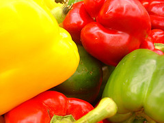
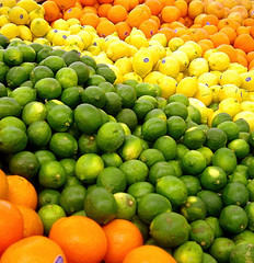
Yellow
The yellow orange colored food are high in bioflavonoids, which work in combination with vitamin C to help reduce the risk of cancer and heart attack. They also contain powerful antioxidants and help maintain healthy skin, strong bones, and good vision. The foods in this group include oranges, tangerines, pears, lemons, nectarines, grapefruit, peaches, apricots, pineapple, pineapple, yellow raisins, and yellow peppers.

Blue and Purple
Blueberries, purple grapes, blackberries, black currents and elderberries contain Anthocyanins which can reduce the risks of heart attack, cancer, diabetic complications, Alzheimer’s disease and age-related memory loss. Dark purple foods contain phenolics, which are powerful antioxidants and can help to slow the effects of aging.

Colored Citrus FruitsOrange
Dark orange foods like pumpkin, sweet potatoes, apricots, peaches, carrots, cantaloupes, mangoes, and butternut squash contain beta-carotene, a powerful antioxident that can help keep your immune system healthy as well as maintain good vision and can even aid in reducing heart attacks and cancer.

Red
Tomatoes, guava, watermelon and pink grapefruit are all red colored foods. These foods contain lycopene which has been much publicized lately as helping to protect against prostate cancer. In addition, these foods can help reduce the risk of breast, and skin cancer as well as reduce the risk of heart attack.
Red onion, cherries, kidney beans, raspberries, strawberries, cranberries, beets, red apples (with the skin), and red cabbage contain anthocyanins, powerful antioxidants that can help control high blood pressure as well as reduce the risks of cancer, heart attack, Alzheimer’s disease, and diabetes complications.

One way to get a colorful plate at every meal is to try to fit in 5 servings of fruits and vegetables every day. Try to include food from all these color groups at least once during the day and you will be surprised at how much your health improves.

Lee Dobbins writes for the A2Z Vitamin And Herbs Guide For Natural Healing where you can find out more about vitamins and herbs as well as natural healing methods.

Source: High Quality Article Database – 365articles.com
Photos taken by Esther PerezCC Some rights reserved

Color Coded Power Types

Power Types
Color Coded Power Types

Our local power provider will introduce new power products starting 1st of October this year. They offer water power and ecological water power, solar power, wind power, bio power, nuclear power and much more. For better readability all the different types of power are color coded.

Fortunately they already offer some ready-made mixtures to choose from which not only rely on colors but also are named (something like ecological power package) and described in detail. And also fortunately the decision has to be made only once and can be forgotten until the next rearrangements.

If you look around you there are uncountable things color coded. Sometimes it looks like as if the designers of such color codes take it for granted that everybody can associate the colors to the correct product, prize, line etc. But that’s a misconception. Too many people suffer from some kind of color blindness and this has to be taken into account when colors are used for labeling.

Remember two simple things when you design color codes for your product:

  • Only three distinct colors can be distinguished for sure: A bright one, a medium one and a dark one.
  • Use text, patterns or signs along the color codes to enhance the comprehensibility.

If you follow these simple rules you will not be on the wrong side when trying to get your point across – at least not for the colorblinds.

Further reading:
Stromprodukte ab Oktober 2006 (German)

Related articles:
Playing Trivial Pursuit with a Colorblind
Colorblind Population

Color Arrangement Tests

By using a color arrangement test you can find out not only if you are colorblind at all but also the type and severity of your color vision deficiency. A color arrangement test consists of a given number of colored chips. These small discs are shuffled and then have to be arranged by the person under observation according to their similarities, starting from a fixed reference color.

While people not affected by any color vision deficiency will arrange it from blue through green, yellow, orange and red according to the hue circle, persons who suffer from some kind of color blindness have severe problems arranging the chips in the right order. They will have some crossovers in the hue circle, whereas the direction of the crossover indicates the type of color blindness.

There are three different well known color arrangement test:

  • Farnsworth-Munsell 100-Hue Test, consisting of 85 colored chips which have to be arranged in the correct order. This test is very time consuming and reveals the type of color blindness but can not distinguish between dichromacy and anomalous trichromacy.
  • Farnsworth Dichotomous Test (D-15), which is built out of 15 distinct color chips. The Farnsworth Dichotomous Test is useful for detecting dichromacys, in particular, tritan defects. A disadvantage is, that minor color vision defects can not be detected.
  • Lanthony’s Desaturated 15-Hue Test has also 15 chips but in contrary to the Farnsworth Dichotomous Test the colors are less saturated. This makes the Lanthony Desaturated Test much more difficult and you therefore can detect more subtle color vision deficiencies.
Farnsworth Dichotomous Test (D-15)
Farnsworth Dichotomous Test Box

Dean Farnsworth was a Commander stationed at the Naval Laboratory and developed the Farnsworth-Munsell 100-Hue Test and the Farnsworth Dichotomous Test (D-15) for the Navy. He developed the tests with the support of others between 1943 and 1947. They were used starting in 1955 for specific job placements.

You can find an online version of this test available here at Colblindor at Color Arrangement Test. All you have to do is to arrange the 15 color discs by similarity, starting with the reference disc. If finished the results are shown in two different representations:

  1. A graphical representation whereas each color chip is shown as a dot in the CIE-color diagram. The dots are connected with lines according to the order of your arrangement. Protan, deutan and tritan axis can be highlighted inside the diagram for an easy verification of the type of your color blindness.
  2. Scores according to Vingrys and King-Smith which are determined from the angles between the connecting lines, producing a color difference vector. The scores consist of three important values:
    Angle, indicating the type of color deficiency,
    Confusion-Index, measuring the severity,
    Scatter-Index, assessing the degree of scatter.

After taking the test you can match your scores to the according values in a table, where all the different types of color blindness are listed. Through this matching and the comparison with the axis in the graphical representation you can verify your type and severity of color blindness.

Farnsworth Test (D-15) Result

On the left hand side you can see my test results as a graphical representation. I mainly mixed up hues from the beginning and the end of the color circle. As the test can primarily detect dichromacy I conclude, that I am not dichromatic but do have a very strong anomalous trichromacy. Looking at the axes of the connections they are a bit messy but are coming closest to the protanopia axis.

Try it out yourself. Maybe you even would like to compare your result not only to mine but also with some results from other tests for color blindness. You can find more articles about tests in the Tests Category.

Check the online version of the D-15 Color Arrangement Test here at Colblindor.

Champions League Final: Barcelona v Arsenal

Today is the day of european football, the day of the UEFA Champions League final. Playing at the Stade the France in Paris we can see two of the best football teams worldwide fighting for the cup.

Arsenal Logo
Arsenal

FC Barcelona, the Spanisch top team featuring Ronaldinho versus Arsenal, the English team from London featuring Thierry Henry. Both teams have not only those two most valuable players but a lot more to offer.

If we look at the colors of the teams I am very happy that these days teams need two different jerseys. Otherwise it wouldn’t be that much fun to watch because the home jersey of Barcelona is blue-red striped and the color of Arsenal is also red.

Coincidentally both teams away jerseys are in yellow. I suppose we will see blue-red against yellow – fortunately for us colorblinds.

FC Barcelona Logo
FC Barcelona

By the way: FC Barcelona was initiated from a Swiss football player named Hans Gamper more than 100 years ago. The legend says that the team colors are a homage at FC Basel, the former football club of Hans Gamper. And also on the other side we can find some relations to Switzerland. One of the most valuable defenders of Arsenal is Philippe Senderos, a Swiss football player which joined the club at the young age of 18 years. Also just recently another Swiss defender Johan Djourou joined him. Unfortuantaley Philippe was injured the last weeks and Johan is not in the starting formation and therefore there is no Swiss participation in the game of the games tonight.

Only 4 minutes to go until The Gunners and Barca will fight for one of the most important cups in football. Let’s go and enjoy some great football.

Update: Barcelona wins the final with two goals in the last fifteen minutes. Arsenal was ahead with one goal for more than 30 minutes, but they had to play with one player less because their goalkeeper Jens Lehmann brought down Eto’o in the 18th minute and saw red for this interception. Arsenal fought well but couldn’t strike at last.

Related article:
Switzerland will Win the FIFA World Cup