Sunsets, Rainbows, Stop Signs for Colorblind Guys

John Trask is 76 years old and is Dealing with color-blindness is whole life. He says,

“I’ve never seen a sunset or a rainbow.”

Is it really possible that somebody can’t see a sunset or a rainbow because of his color blindness? – I can’t believe it.

SunsetWith not seeing a sunset he can only mean not to see the beautiful colorized sky and sun during a sunset. Seeing the sun going down behind the horizon can’t be a problem even for a colorblind person. And to my eyes also some beautiful colors can be perceived.

I’m red-blind, or at least strongly red-weak. And a sunset can be something really beautiful even to me. Of course, it will never be as colorful as for a person with normal color vision. But isn’t everything just less colorful for us colorblind guys?

RainbowAnd it’s the same for a rainbow. I can definitely see a rainbow—just less colorful.

A rainbow consists of the whole color spectrum and this with a blue sky or gray/white clouds in the background. So if you can’t see a rainbow, you must not be able to distinguish all colors either against blue or gray. And this could only be the case, if you suffer from a complete color blindness.

I don’t believe, that somebody with red-green color blindness can’t see a sunset or a rainbow. You can see them, but just less colorful as everything else on the world.

Stop SignBut what I agree on is another of John’s statements.

“Stop signs disappear,” Trask said. “The white lettering I can pick out, but [the rest of the sign] just fades into whatever is in the background.”

What are your experiences with sunsets, rainbows and stop signs?

Pictures by vtveen, Mundoo and overundulate.

Interview with Chris Rogers from COLOURlovers

Chris Rogers—also known as the lover named ruecian—is the man behind the site blog of COLOURlovers. I already reported about them, when they covered the topic of red-blindness just a bit more than one month ago.

Out of this first contact evolved the idea of an interview-exchange between the color blindness lovers from Colblindor and COLOURlovers.

As Chris is an expert on the topic of colors, in exchange he asked me some more details about color blindness, including positive and negative aspects of it. I hope you enjoy the following answers from Chris and make sure that you also visit the counterpart of this interview-exchange.

Colblindor: What is your favorite color and why?

Chris: I surround myself with blue because it’s such a daydreaming, imaginative nature. As someone who experiences synaesthesia, a sort of crossing of senses, blue is also the colour that has the best texture to me. With colours, I experience textures along with the visual aspect, and with music, I experience colours and textures. I like a lot of yellow, brown, and blue songs, so, I’ll say that those are my favourite colours.

Colblindor: COLOURlovers is a big resource concerning different aspects of colors. What are the main purposes of your website?

Chris: What I’ve come to find about COLOURlovers is that it’s sort of a playground for creativity, as the site has attracted colour-passionate and colour-oriented professions from fields of design and art. We also have people whom have said they would have never dreamed of playing with colour before stumbling about COLOURlovers, and have since become ‘colour addicts.’ I’d say we’re here to give an open, supportive space to the minds that want to come out and play, and I try to do that with my blog posts by posting something of interest, whether it be science or something inspirational.

Colblindor: Do you think color blindness might be some sort of handicap to join your community of lovers?

Chris: Oh, I don’t think so. Some of the palettes that users (colour-deficient or not) create might look a bit off, and the palettes that are based off of emotions might not convey the same message, but it all ends up meaning something to someone, as I feel colour and colour symbolism is loosely based in interpretation. Just as everyone feels differently about Picasso, everyone can find their own enjoyment in seeing a red palette, even if they don’t know it’s red.

Colblindor: You’re writing all about colors. When did it first come to your mind, that there is also a community of colorblind people and do you offer also some information, help or support for them?

Chris: I made a colour maybe what I guess to be about a year ago called ‘of Colourblindness,’ which was grey. And I remember having a note passed to me asking about colourblindness, and it was really my first venture in trying to explain it to someone. I had always understood the concept, but never had to put it into words. The idea had been in my mind since about that time, and surfaced soon after the blog began as the article that you found, which I wrote on Protanopia.

Colblindor: Do your users ever bring up the topic of color vision deficiency or is it almost not existing among lovers?

Chris: It has been asked before. There was a post on the forum about it, someone mentioned that they suffered from colour-deficiency, and needed some help pulling colours accurately from a painting. I do know that there are at least a few colour-deficient users on the site. It’s not a typical topic, though. I think hearing ‘COLOURlovers’ can be a subject of much fear for someone who can’t see colours like others can, but it’s really not about who does colour better, it’s about a love of colour, and I don’t think colour-deficient or colour-blind people are exempt from that.

Colblindor: Can you tell us something about the ‘headline’ of COLOURlovers “Fight for love in the colour revolution”?

Chris: As far as fighting for love, there is a rating system in place that ranks colours and palettes by how many votes they received and how many users have added them to their favourites lists. I think it’s also about how many comments are left, but I’m not sure about that one. I believe that COLOURlovers is changing minds about colour by bringing it to a field where anyone with hand-eye coordination can play, rather than having it restricted to artists with paint, or tailors with cloth. When I first stumbled upon the site in 2005, I was really cautious about my colour choices, and I created a lot of colours that were already in my life. The community is so very supportive. I’ve yet to see something negative said about something. In fact, I’ve even seen, “I love how ugly this is,” and it gets voted high. In getting used to COLOURlovers, I’ve essentially discovered a whole new world and my thought process as a synaesthete has been allowed externalisation. That’s what I think is meant by the ‘colour revolution.’

COLOURloversIf you enjoyed Chris answers, be sure to also check out his questions, published at the site blog of COLOURlovers. And if you enjoyed my questions, you might like to subscribe to the RSS feed of Colblindor, which ensures that you get frequently the latest updates and insights on color blindness.


How to Color Charts Respecting Color Blindness

If you are suffering some type of color vision deficiency you definitely know those situations: You try to read a beautifully colored chart, whereas the biggest challenge turns out to be matching the legend to the appropriate part inside the chart itself.

All the different type of charts usually have one thing in common, they have a color coded legend. This looks very nice and helps to differentiate between the labels and the information you want to highlight. But this doesn’t take into account, that colorblind people might have great difficulties to match the correct labels to their counterparts or even tell the different segments apart from each other.

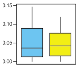
Blue Yellow Graph
Blue Yellow Graph

Just recently the guys from evolgen asked A Question for the Colorblind, where they try to find good colors for some informative charts. The solutions vary between using only shades of gray and random color suggestions from non-colorblind people. I don’t think this is the right answer to the question on how to color a chart taking into account also colorblind readers.

Scott from Standardzilla tries to go a more elaborate way. He is looking for good color combinations and analyzes the color contrast as well as the simulations of different color vision deficiencies. Introducing his thoughs with Color Blindness and Graphs and analyzing it at Colour Contrast Chart for Colour Blindness.

I propose we even have to go one step further. Here is my recipe on how to color charts respecting color blindness in three steps:

  1. Start with the theory of color blindness. The confusion lines are a great resource to discover colors that are and aren’t distinguishable by all three types of color vision deficiency.
  2. After you have chosen some colors which are not on the confusion lines of neither protan nor deutan nor tritan defects, enhance the color contrast as much as possible, while adjusting the brightness of each color.
  3. Check the adjusted color combination with one of the many available color blindness simulation tools. If the simulated colors look to close to each other, start all over again.

This three simple steps are not as easy to follow as it sounds. I suppose it will consume quite some time to really find the best colors for your colored chart while having in mind, that also colorblind readers should be able to catch your information easily without spending to much time on color legend deciphering.

There are also some quicker ways to improve the readability of your charts:

  • Patterns: Not only use colors but also patterns to mark your charts.
  • Label Inside: If possible, label the charts inside themselves or…
  • Label Outside: …attach each label to its segment (e.g. around a pie chart).
  • 1 Color and Brightness: Use only one color and alter only its brightness.
  • Grayscale: And of course, you can use just different shades of gray.

If you either try to find some good colors for your chart which suite everybody—even the colorblind people among us—or if you take a quick-win doesn’t really matter. Just bear in mind, if you offer a chart with a bad color choice, one out of ten males might have problems with its readability, which doesn’t really help to get your point across.

Carnival of Colors IV – Strolling

This is already the fourth issue of Carnival of Colors. Please welcome the contributors and dive into the beautiful world of colors.

For the Carnival of Colors IV we have again some great submission which I would like to share with you. And be prepared for the next time, because for the first time Carnival of Colors will be hosted not by Colblindor but by the famous birdwatcher Mike Bergin from 10,000 Birds.

Strolling

« While Irina was at a cafeteria she found this little nice garden. Strolling through it she took some really colorful pictures and realized, that she’s Surrounded by Beauty. This doesn’t really look like living dangerously to me does it? »

« You can see some more beautiful colors at Spring Days on the Riverbank. Riversider, the author of the Ribble Cycle Diaries, says “The predominant colour here is green”. It definitely is, but I can spot many more nice colors there. »

« To take some beautiful and colorful pictures you don’t have to go far. Christopher from Photographer’s Journey found the Colors of the Rainbow just around the corner. »

« Going round the corner and strolling pass a florist, don’t pick the red flowers for your beloved, because this are just Guy Colors. Doug knows more about it at Doug Green’s Garden, saying, “A politically incorrect but true story about garden flower colors.” »

« So you shouldn’t pick the red flowers but what about seeing red while you are collecting tokens. Alejna knows more about all the red folks out there. »

« I suppose Mike was strolling around almost a bit too long tonight. Watching maybe some late-night birds out of his 10,000 Birds. But anyway, it’s never to late to jump on the boat. And the birds which ‘Color me Rosy‘ just fit in nicely into this series. »

« Special entry by Suzan: Just read her story about the Blue Scratch and learn more about it, her and her blogstory at Behind the Politeness of It All. »

A great thanks to all the contributors. Stay tuned for the next release and join in whenever you have something to say about colors. You can find everything you have to know about the carnival at Carnival of Colors or just send me a note including the link to your article to be included in the next upcoming issue.

Blogtipping the Blogosphere

I was getting blogtipped last month by Scott from Standardzilla which was really a surprise—even if he still owes me a real tip. This first of the month I would like to keep the ball rolling.

Blogtipping was brought into being by Easton from Business Blogwire. It’s more than a year old and his doing it every first day of the month. So what is blogtipping?

  • surprise a fellow blogger
  • point out three great things you enjoy
  • share a tip

As I said, I would like to pick it up and do my first blogtipping today on June 1st. I have the following blogs ready for you and hopefully as a surprise for them:

Number one: Presentation Zen by Garr Reynolds

  • Really great tips on how to become a good presenter and improve your presentation skills.
  • Garr has always some great examples ready to emphasize his statements. He also is linking up to every other bits of information.
  • Insights into to Japanese culture and work life.
  • Tip: The articles are for my feeling often to long. I very much like reading them and learn new stuff through them, but often struggle to read through the whole posts. I personally would prefer some shorter articles.

Number two: Eye on DNA — How’s it going to change your life? by Lei Hsien-Hsien

  • This is definitely the place to learn the latest about DNA, genes, the genome and more.
  • Covers everything on the news and doesn’t forget any interesting links.
  • She is really a great back-linker and shares links to everybody who linked to her—and a lot more.
  • Tip: On certain days it’s just to much information coming in through Eye on DNA. I would prefer some less posting; but what could be dropped?

The last one is a blog written in German and therefore I’m writing the next few lines also in German.

Nummer drei: pixelgraphix von Manuela Hoffmann

  • Interessante Tipps und Tricks aus der Online- und Webdesignerwelt.
  • Sehr gute Verlinkung auf weiterführende Informationen, Websites, Downloads und Originalartikel.
  • Kurze und prägnante Artikel wie zum Beispiel Farbfehlsichtigkeit mit Color Oracle simulieren.
  • Tip: Ich wünsche mir manchmal etwas mehr ‘persönliche Meinung’ und weniger ‘Zusammenfassung’ in den Artikeln, denn ich verlasse mich gerne auf den Rat der Expertin.

That was it for this time. Maybe I’ll pick it up again in the future to have a nice little gift for some fellow bloggers.

City University Online Color Vision Test

The City University of London has a well know Department of Optometry and Visual Science. They invest a lot in research for color vision and color vision deficiency which includes their own color vision clinic.

A well known color blindness test called City University Color Vision Test is available in a print version and often used to identify tritan deficiencies. This test is derived from the well known D15 color arrangement test and is based on different plates, where out of four dots the one which comes closest to a fifth dot has to be selected. If you only have very mild form of color blindness, you will pass this test. But on the other side the City University Test allows to identify the type and approximate severity of color blindness.

City University Test
Can You Spot It?

Now for all of us, looking for a way to test one’s color vision abilities online, they developed a web based color vision test. The test is a little (very uninteresting) movie, consisting of pictures which look like the one right here. In each picture there is a square, which might be hidden if you are suffering from some type of color blindness.

The movie is twelve Mb long, so you need a fast link to play it. But if you can play it, you will have to chance to find out if you are suffering from some type of color blindness. There are some facts which are really great about this test:

  • The test is not only made to detect red-green color blindness, but also for people suffering from blue-yellow color blindness. This is not often the case. Specially the well known Ishihara Plates tests are only for red- or green-weak respectively -blind persons.
  • Different severities of color blindness are covered within this test. If the square is not visible to you for only a few seconds, there is a big chance that you are suffering some type of color vision deficiency.
  • It’s the most simplest color blindness test, covering a big range of deficiencies. You only have to watch and see, if you always can spot the square.

There is of course also a downside to this. Through this movie you won’t find out how severe it is and which type it is. You don’t even get a feeling, because you don’t know if you can’t see the square for let’s say ten seconds, what this means. Is it just a mild form of color blindness or not? Only the eye specialist will be able to tell you for sure.

Maybe you already have downloaded the web-based color vision test and watched the movie. If the square disappeared for you for some time, you might like to compare your results to my ones. From other online tests and what my doctor told me once upon a time I know, that I have some form of very severe red-weakness or red-blindness. And my test results are:

  • Square disappeared 1. time from 0:16 through to 0:26.
  • Square disappeared 2. time form 1:04 through to 1:11.

What are your results? It would be great to have some others to compare with. But always keep in mind, that online color blindness tests can’t tell you the truth because there are to many factors like display settings and illumination which affect the test results. To get a proper screening you have to visit your eye specialist.

Color Blindness – Reason for a Job Rejection

One reader of Colblindor was so kind to write me his story about a job rejection because of his color blindness. It’s not a severe color vision deficiency he is suffering from and the job is mostly down with computer support, but he was still rejected.

Well, yes I was declined for one job for my red-green blindness. It was a job in the area of car paint development (research and development). I have worked in the past in areas that have something to do with color (formulation an equalizations) and it never represented for me a problem (I have to say that some times I noted that some colors were harder to make equal than others, but nothing more…). The doctor said that I wasn’t able to do my job.

By now I am trying to demonstrate that I’m perfectly able to that that job. Principally because the equalizations process doesn’t base upon the only eye of the human, the coloration process is carried on with the support of scientific instrumentation, like colorimeters and spectrometers, a lot of times more objectives and exacts than the weak human eye…

Note: Do you know what is the worse about been rejected for a job? They don’t even tell you why, they just say you…”a problem with the vision” :(

Were you ever rejected for a job because of your color blindness? It would be great to hear more about it.

Contribution by Israel F.F. Thanks a lot.

Mixing Up Blue and Green

Are you mixing up blue and green? What about red and green? It’s not only the color green which causes problems to colorblind people, but how can you know which type of color blindness causes the confusion, specially when it affects your child?

My son will be four this year…. It appears that he sees and can recognize all colors except for certain blues and greens. Sometimes he can point out a deep blue, however he often mixes up lighter shades of each. Is this Tritanopia? Or some version of it?

Before we get into some more details about colors and types of color blindness, I would like to state my thoughts on age and recognition of color blindness.

Already a few month old toddler has the same color spectrum as an adult. But only at the age of two they can start naming colors. And again it takes quite some time until a child really can grasp the whole color spectrum. Therefore a four year old child might need still some more time to learn all the colors. I think first of all you should wait two more years to finally judge about color blindness. There is still enough time at the age of six to consult an eye specialist and check for color vision deficiency.

On the other side it’s a good age to learn about color blindness and try to understand, how the world looks different to somebody with color blindness. You can learn how to support your child with everyday tasks and you might get a better understanding, why certain things are not that easy to accomplish as a colorblind child (or adult).

Mixing up blue and green
Every colorblind person can have problems distinguishing blue and green, no matter which type of color blindness. Why is that?

If you suffer from any type of color vision deficiency, you have quite a different color perception compared to somebody with normal color vision. They can distinguish more than 100 different hues. Color blindness reduces this, down to just around 20 different color hues with a severe color vision deficiency.

The CIE color space shows the whole color spectrum. When looking at the confusion lines of the CIE color space, you will recognize, that blue-yellow colorblind people definitely have problems with the color axis going from blue to green. But on the other side, if you are suffering from red-green color blindness, your spectrum of different distinguishable hues can be very limited. Because green flows into blue it can also cause problems between those two colors.

Therefor it’s not easy to tell which type of color blindness you are suffering from, when you can’t tell apart some shades of green and blue.

You have to learn more about the color vision deficiency affecting your child. Maybe some tests could help you to improve your knowledge. It’s definitely not easy to do those test with a four year old. In this case the color blindness testing poster could be of some help. But as I explained above, there is still enough time to learn more about it and otherwise there is always the possibility to visit your eye specialist, which is also the only way to receive a correct diagnosis.

Do You Have to Order Your Markers to Know Their Colors?

How can you remember the color of your markers or crayons if you are colorblind? You can not, if you don’t use any trick which helps you to remember the colors they have.

The following reader question reached me a few days ago and points out this well known problem. Everybody suffering from color blindness will remember the time, when he had to use some kind of a system, when the marker box was to large to tell the different colors apart from each other.

My friend claims he is red-green and blue-yellow colorblind and said that as a kid had to put all of his markers back in the box in order so that he would know which color was which in school. I know the receptors in the eye are red, blue, green, and yellow? So can he see any color at all?

I would like to split this question into three different parts, each one covering a one part of the above statements.

He is red-green and blue-yellow colorblind. To chance to suffer from both types of color blindness at the same time is very very very low. If you really suffer from blue-yellow and red-green color blindness, you will definitely mix up a lot of colors. But on the other side, even if you are red-green colorblind this doesn’t mean you only have problems distinguishing red and green but many different colors like: orange/green, blue-green/gray/purple, red/dark-green/brown, and more.

The receptors in the eye are red, blue, green, and yellow. Well, that’s not quite right. With normal color vision you’ll have three different color receptors which are most sensitive to blue, red, and green respectively. If you are colorblind, at least one type of color receptors is either missing at all (dichromatism) or the peak of sensitivity is displaced (anomalous trichromatism).

So can he see any color at all? Yes, he can see colors and does not only precept shades of gray. There is only one exception to this, when you are suffering from achromatopsia (monochromatism). But as he can use markers he must be able to see some colors. When you are colorblind you still can enjoy a very colorful world, which is just less colorful compared to somebody with normal color vision.

So each one who is colorblind needs a trick to handle the problem of an oversized marker box. I also remember the time at school where I just knew by heart which crayon had which color. When I had to use the box of a friend of mine, I was lost. And unfortunately this doesn’t stop with marker boxes but accompanies you through your whole life.

You have to learn colors and remember them, again and again, and of course you get better when growing older. Don’t you?

Are Colorblind People Disabled?

If you are colorblind, do you feel disabled? And what does the law say about it? Do others have to take some precautions, in a way that colorblind people are not excluded because of their handicap?

There is an interesting discussion going on at boagworld.com, if color blindness has to be looked at as a disability or not. In this case looking at the UK law and their Disability Discrimination Act (DDA). The question is not easy to answer, because there are many different types of color blindness and the law doesn’t really name any disability, but just describes them.

You might like to join the discussion at Are colorblind people disabled?

Do you think color blindness is a disability or not?